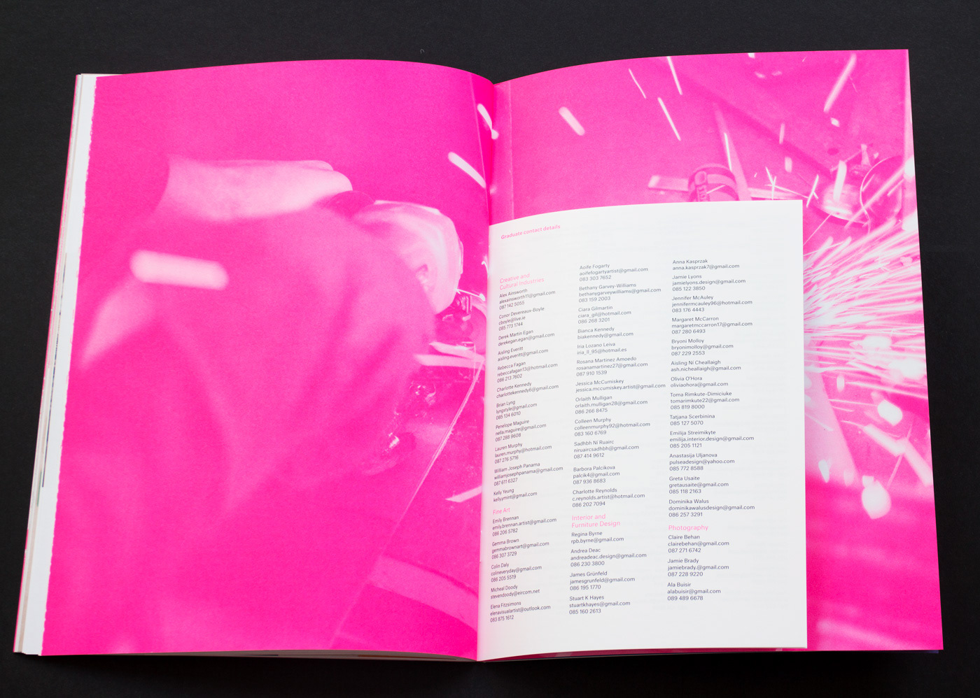
Background
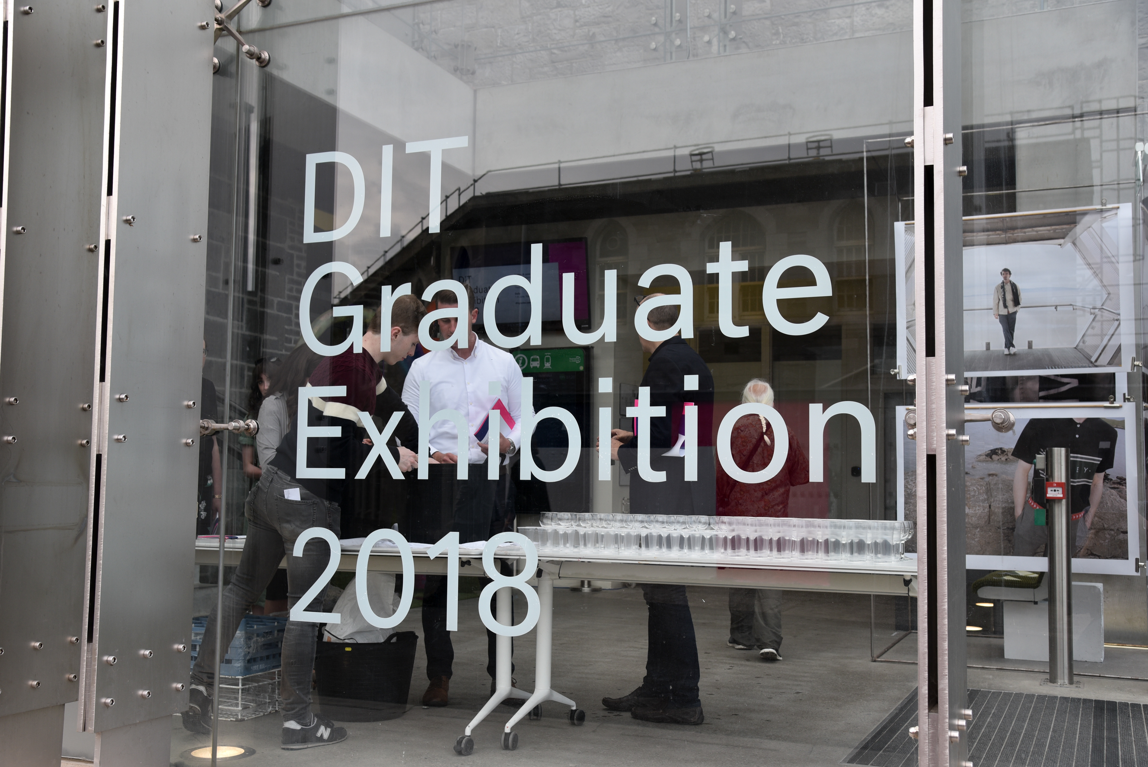
Each year Dublin School of Creative Arts holds its Graduate Exhibition to show off the talent that the college has produced across its creative courses. The show is used as a way for the public to get a glimpse at the work produced by its graduating students. A team of Visual Communication students are chosen to work on the exhibition based on a pitch they present to the graduate exhibition committee. Myself and four other students were selected to design and implement a brand identity for the graduate exhibition along with its accompany touchpoints across and digital, print and wayfinding platforms.
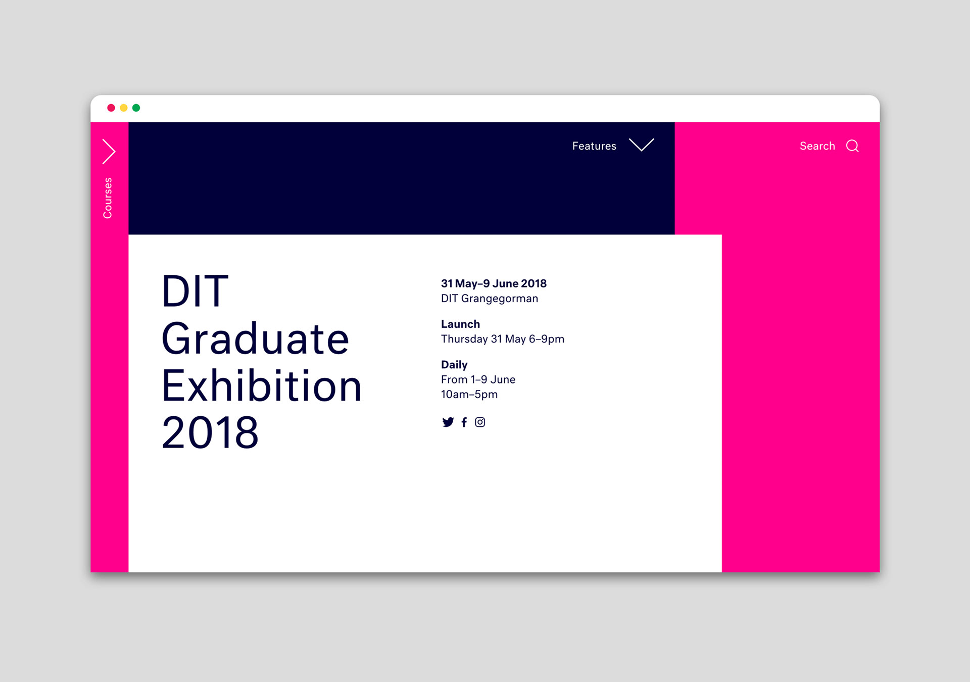
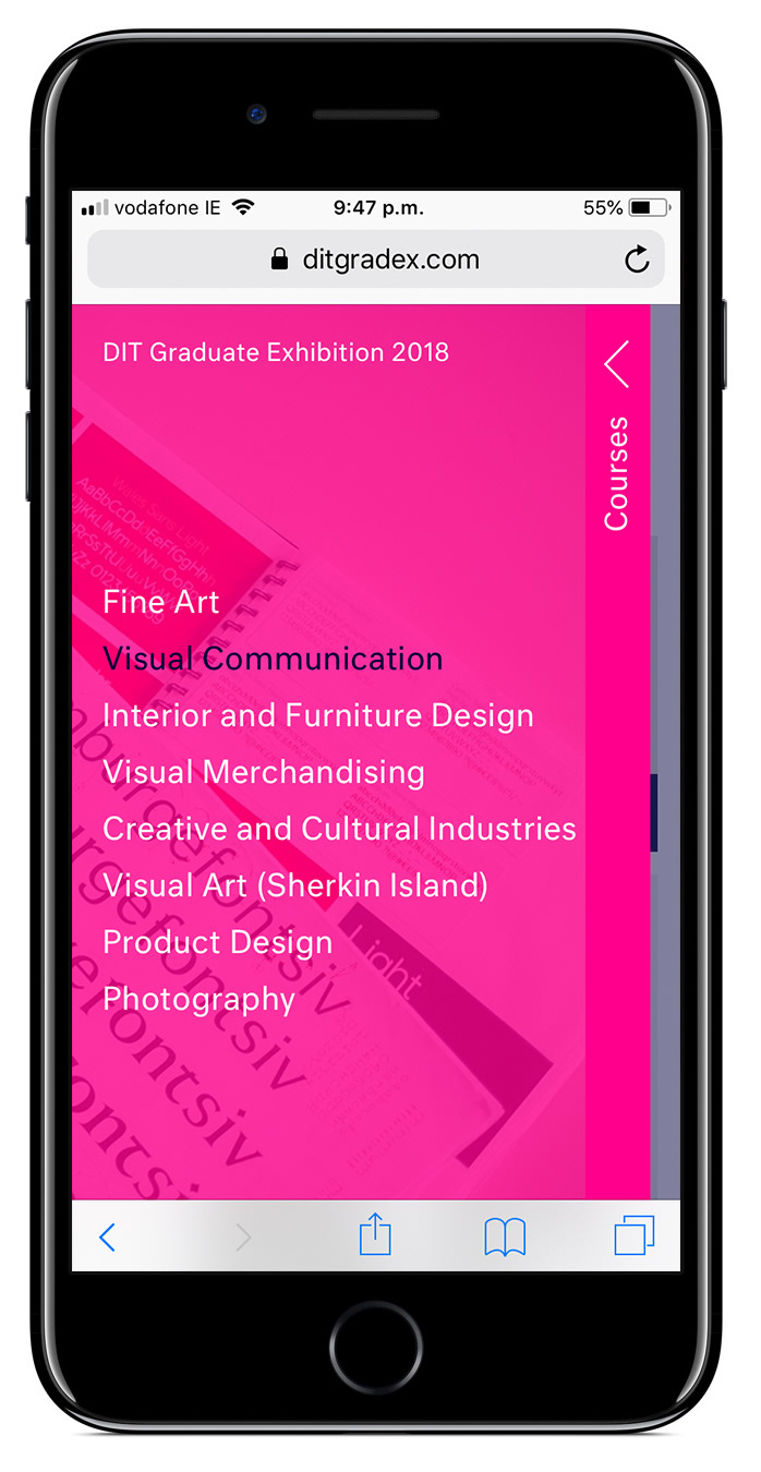
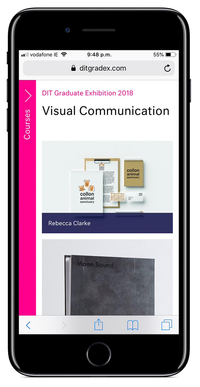
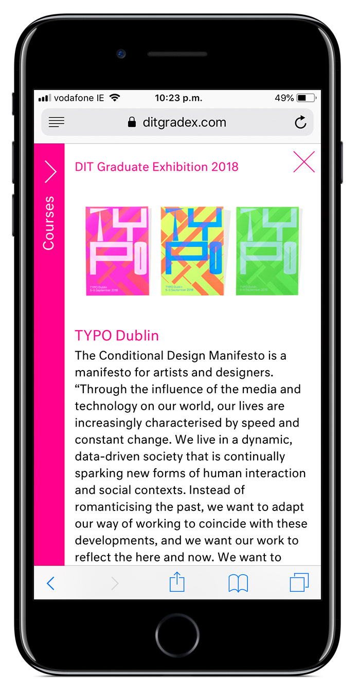
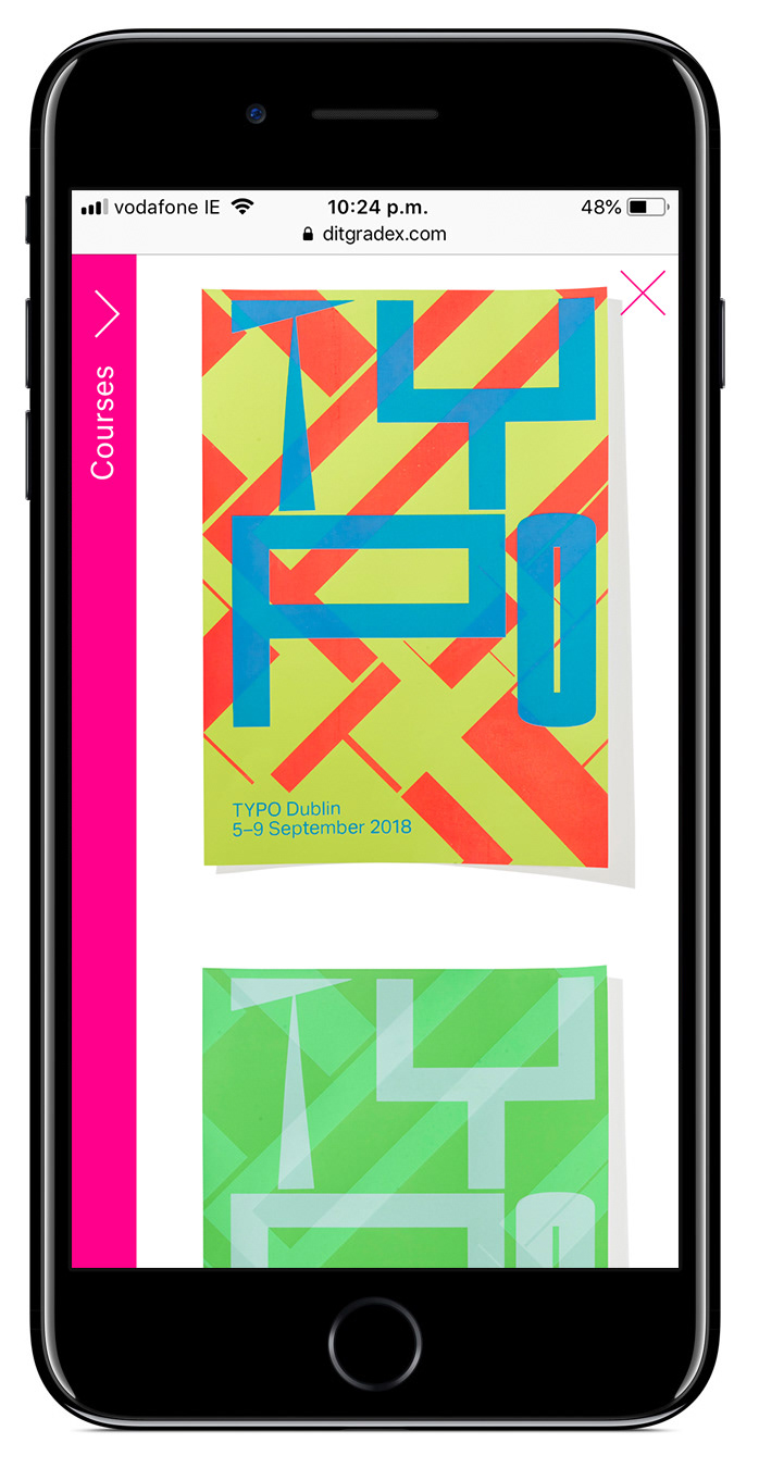
Website
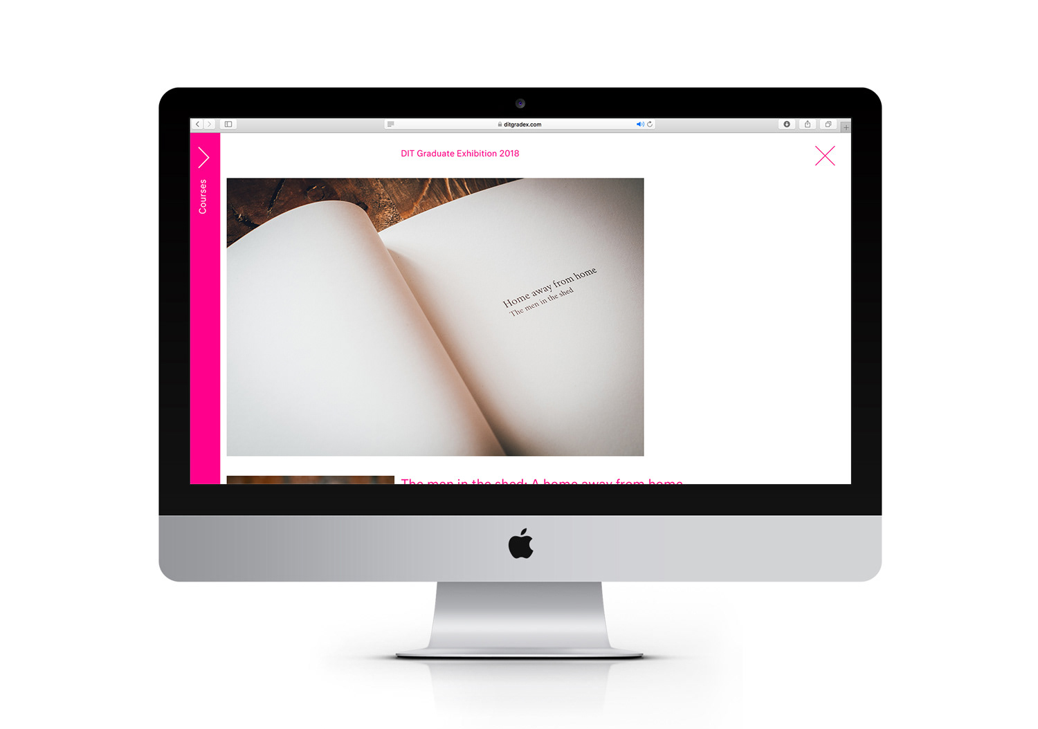
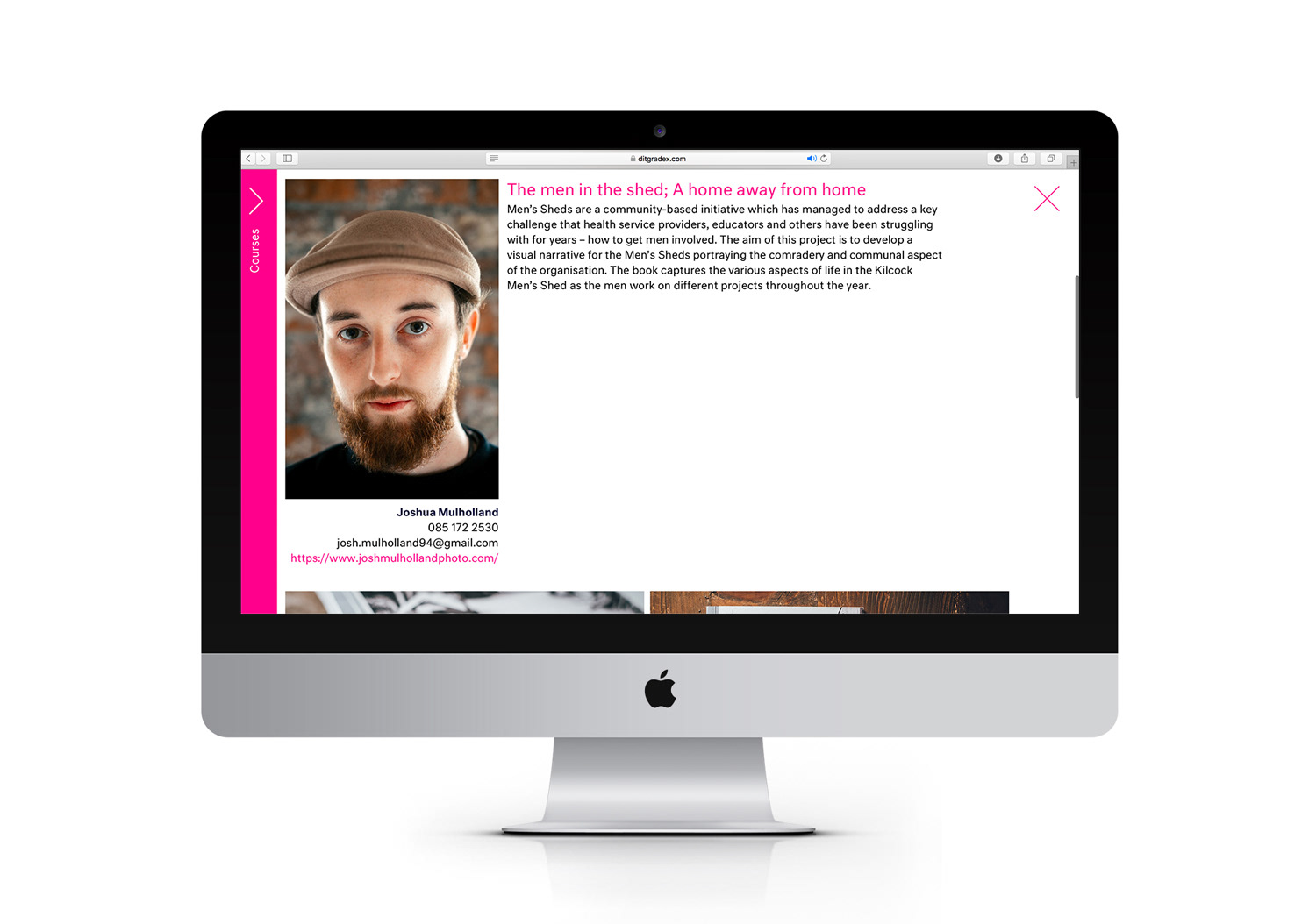
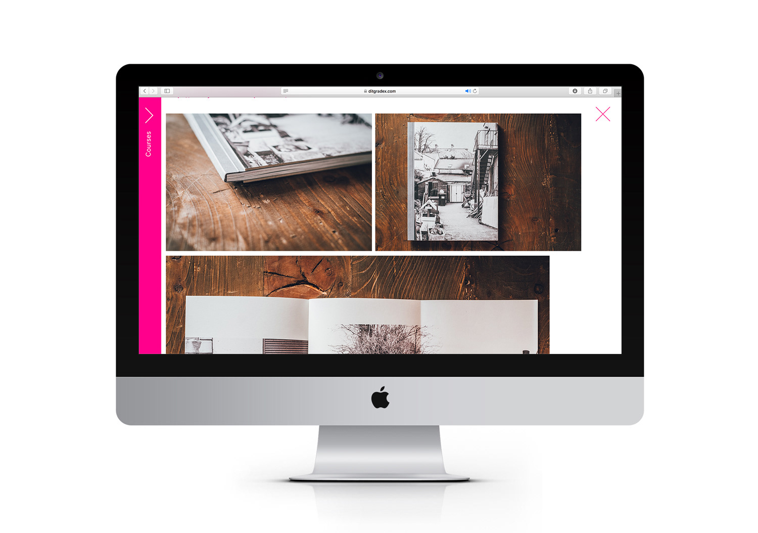
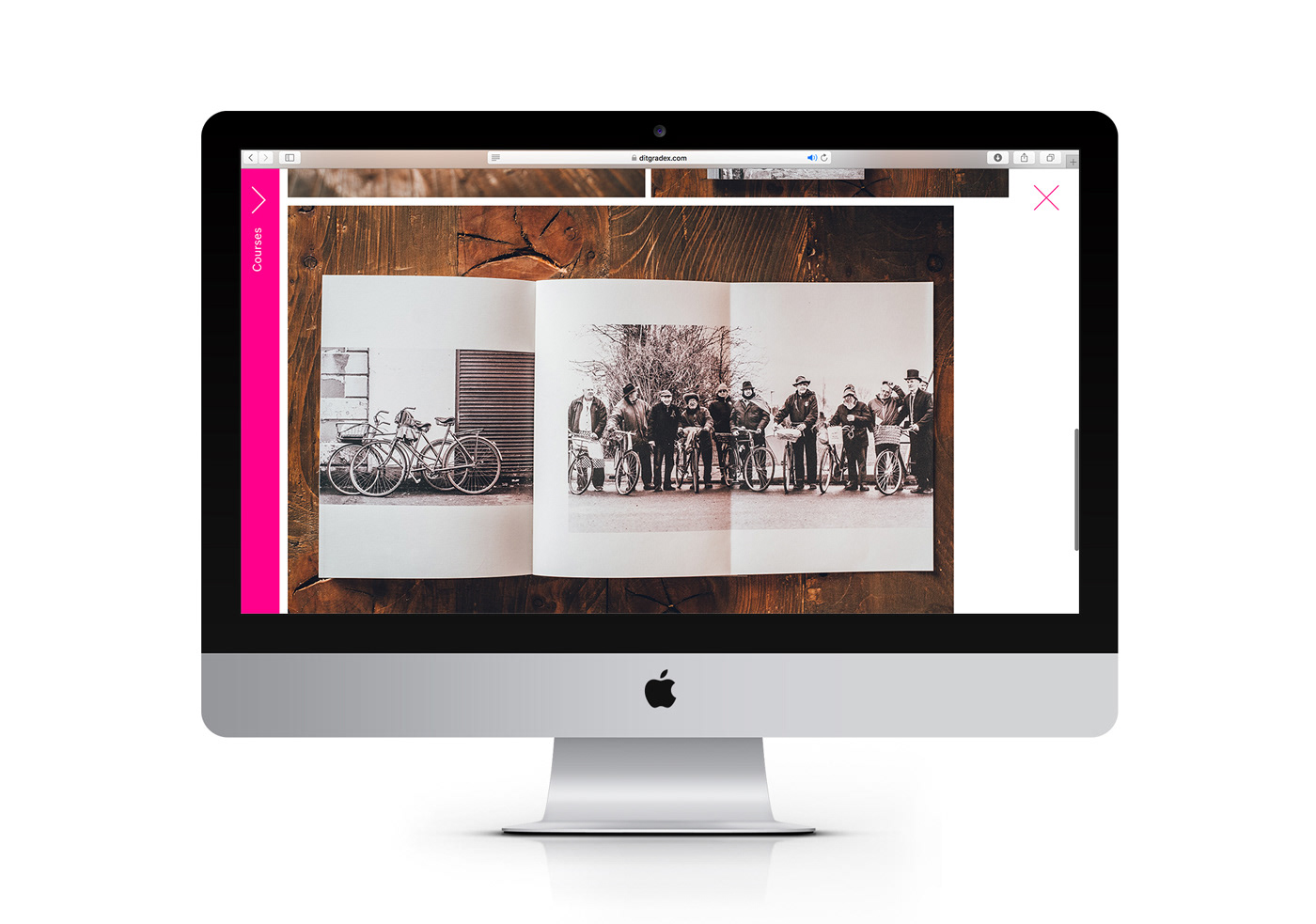
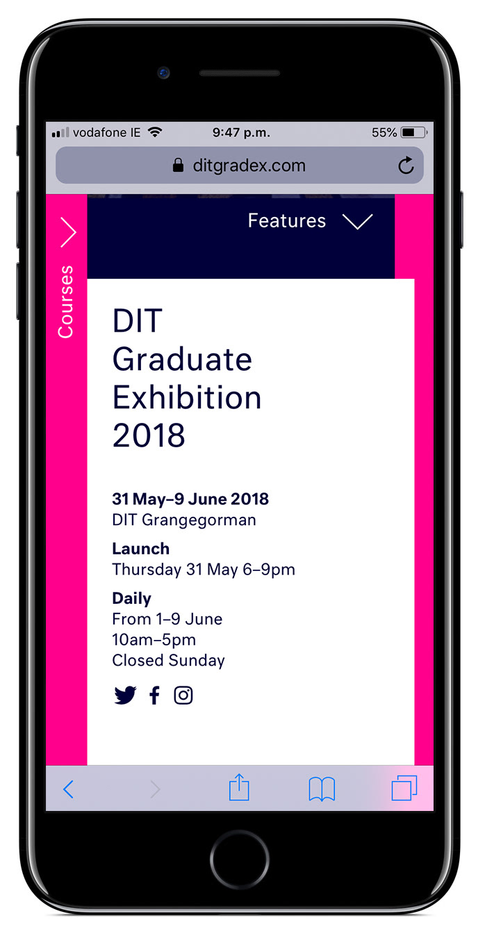
The website was a major part of our proposal for this years graduate exhibition. This year we decided to move the entire catalogue of graduate students work online enabling it to have a broader reach and a longer life span. The digital platform also allows the students work to be showcased better than the previous printed method.
Check out the website for yourself at ditgradex.com
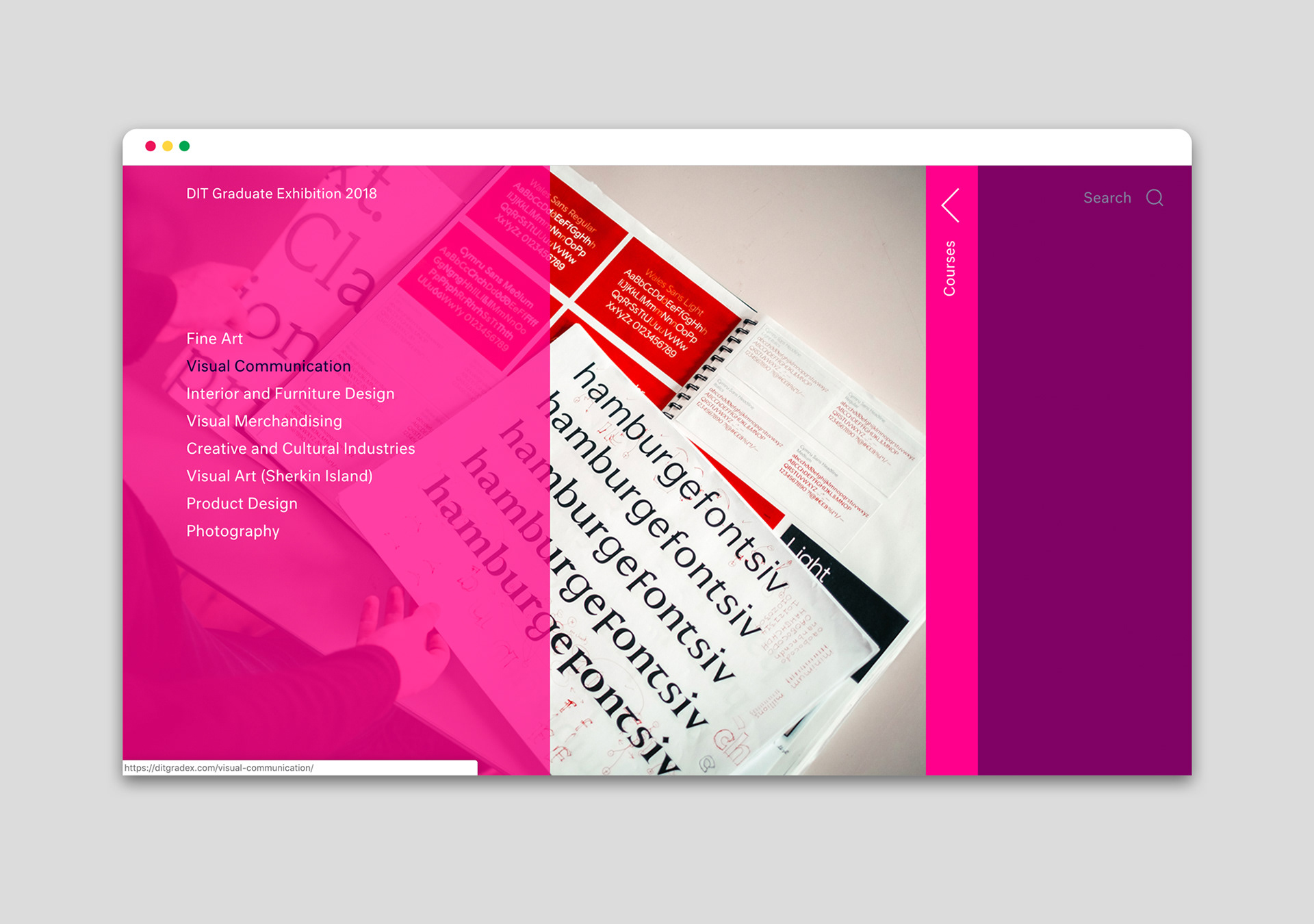
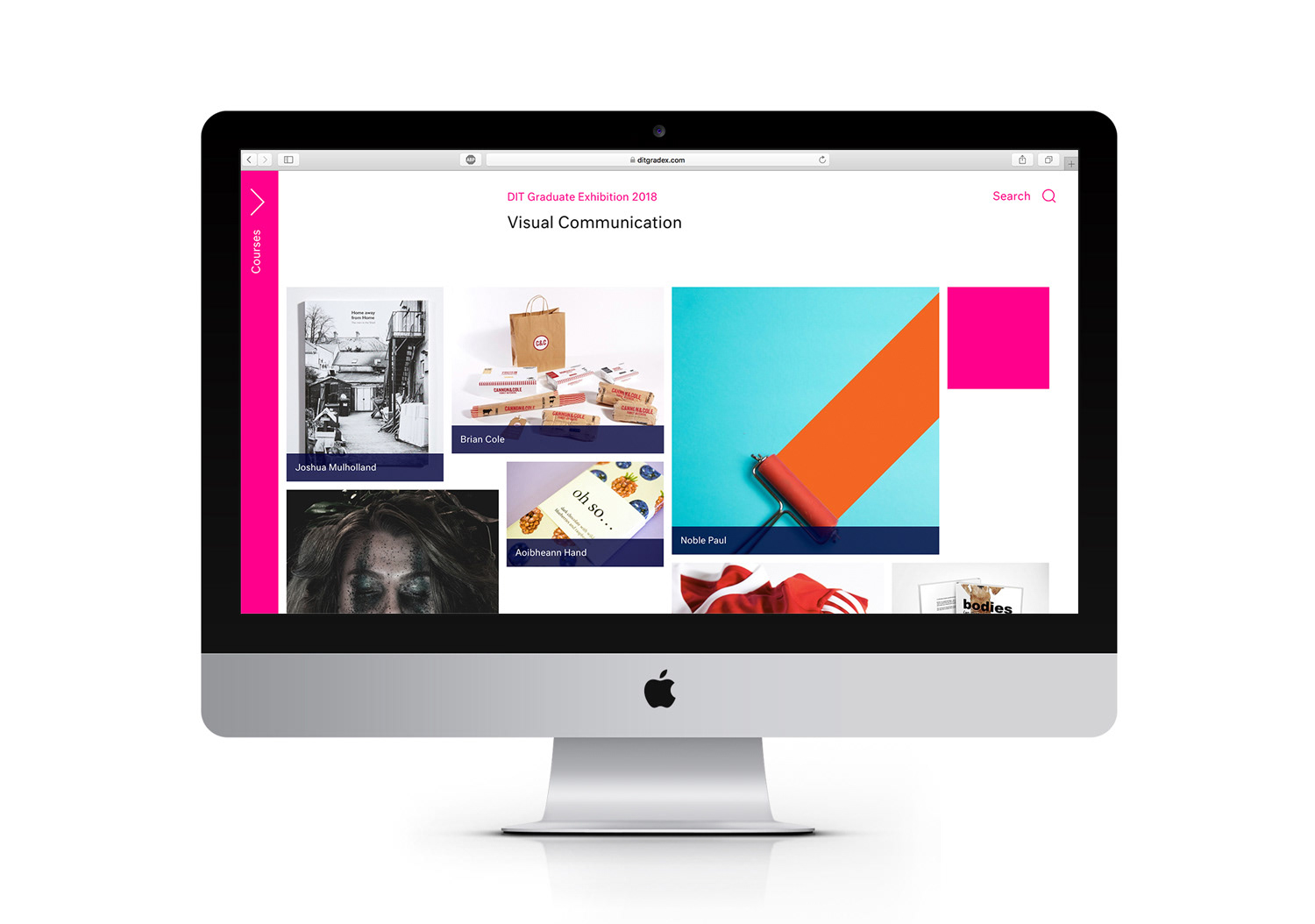
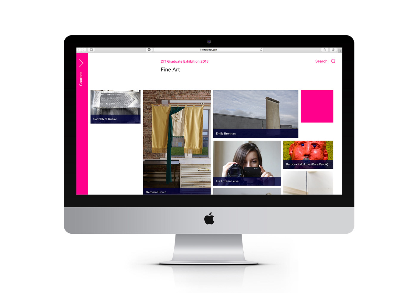
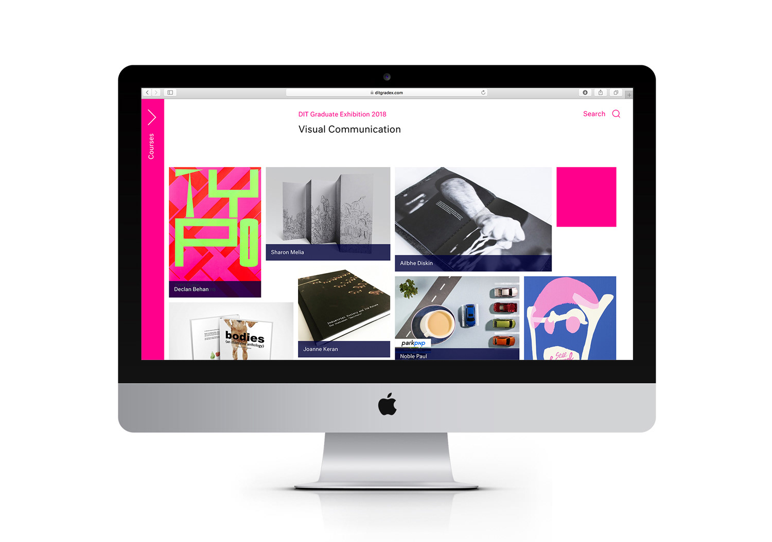
On each of the course pages we created a modular grid system that constructs a new layout on each page refresh or when you click the pink boxes. This ensures that no students work is featured more prominently than another.
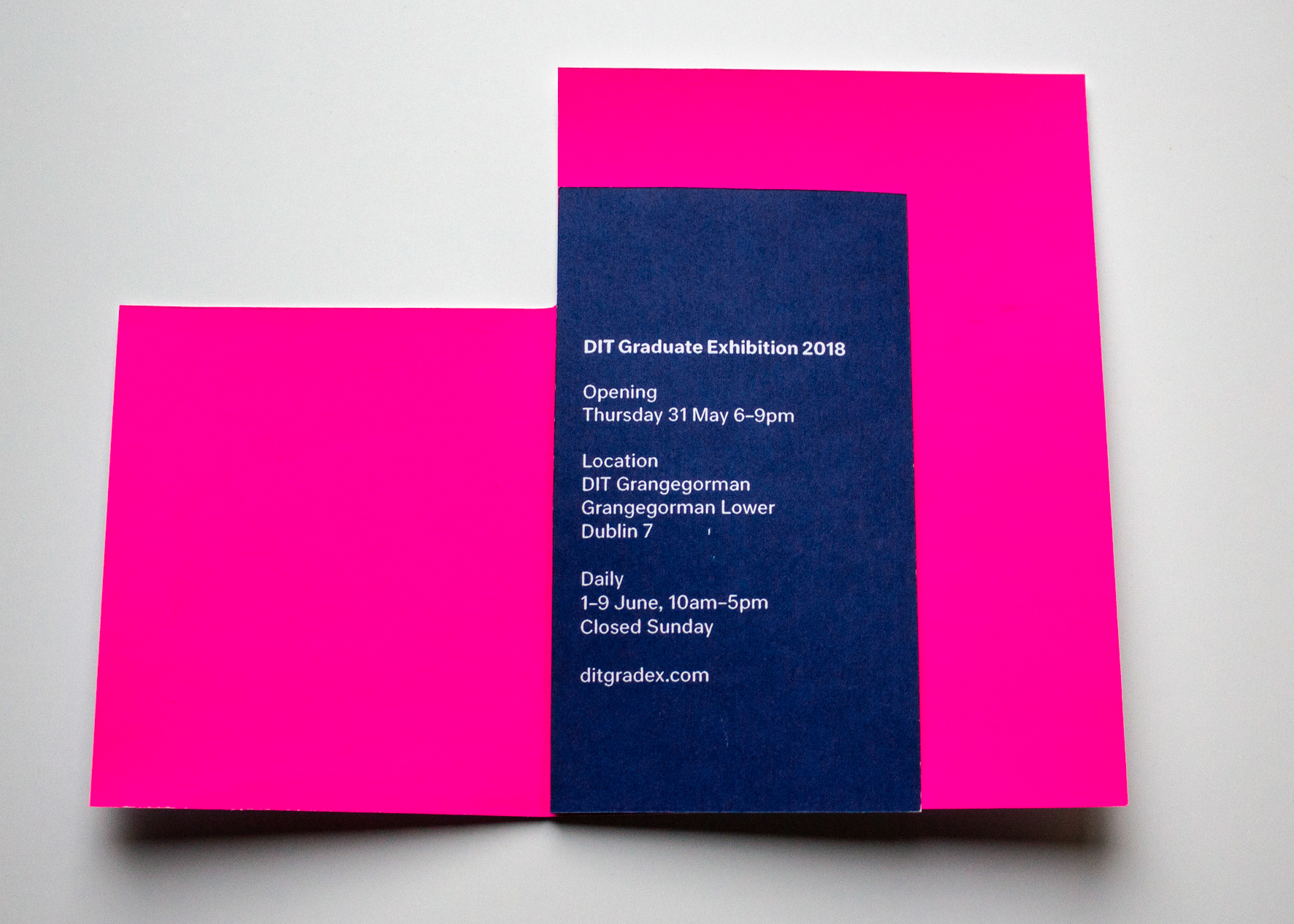
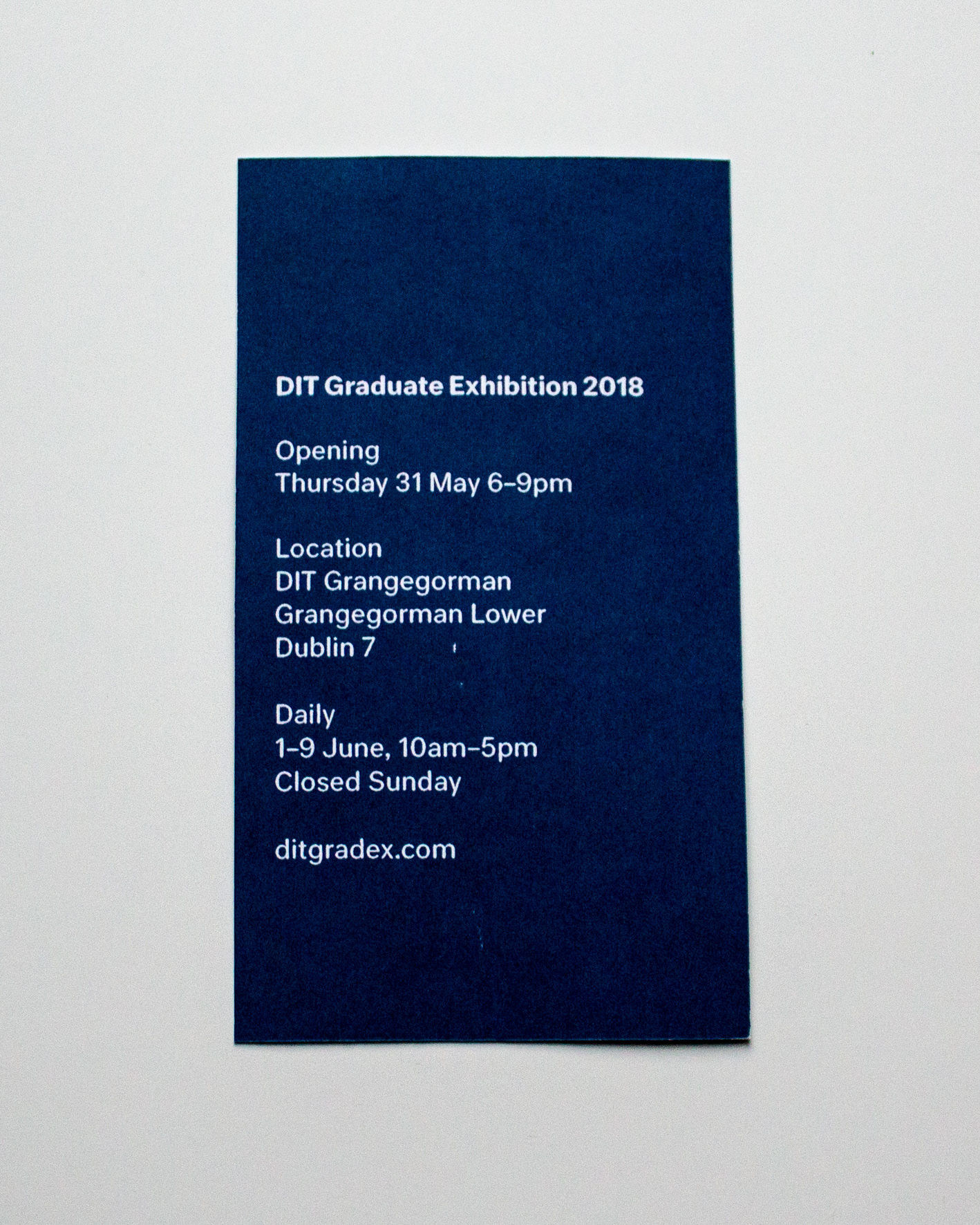
Invitations
200 screen printed invitations were created to be sent to alumni, design studios, VIPs and other industry professionals. The invitations were screen printed on Cocoon 250g white card with C6 PLA Clear Eco Bags as envelopes.
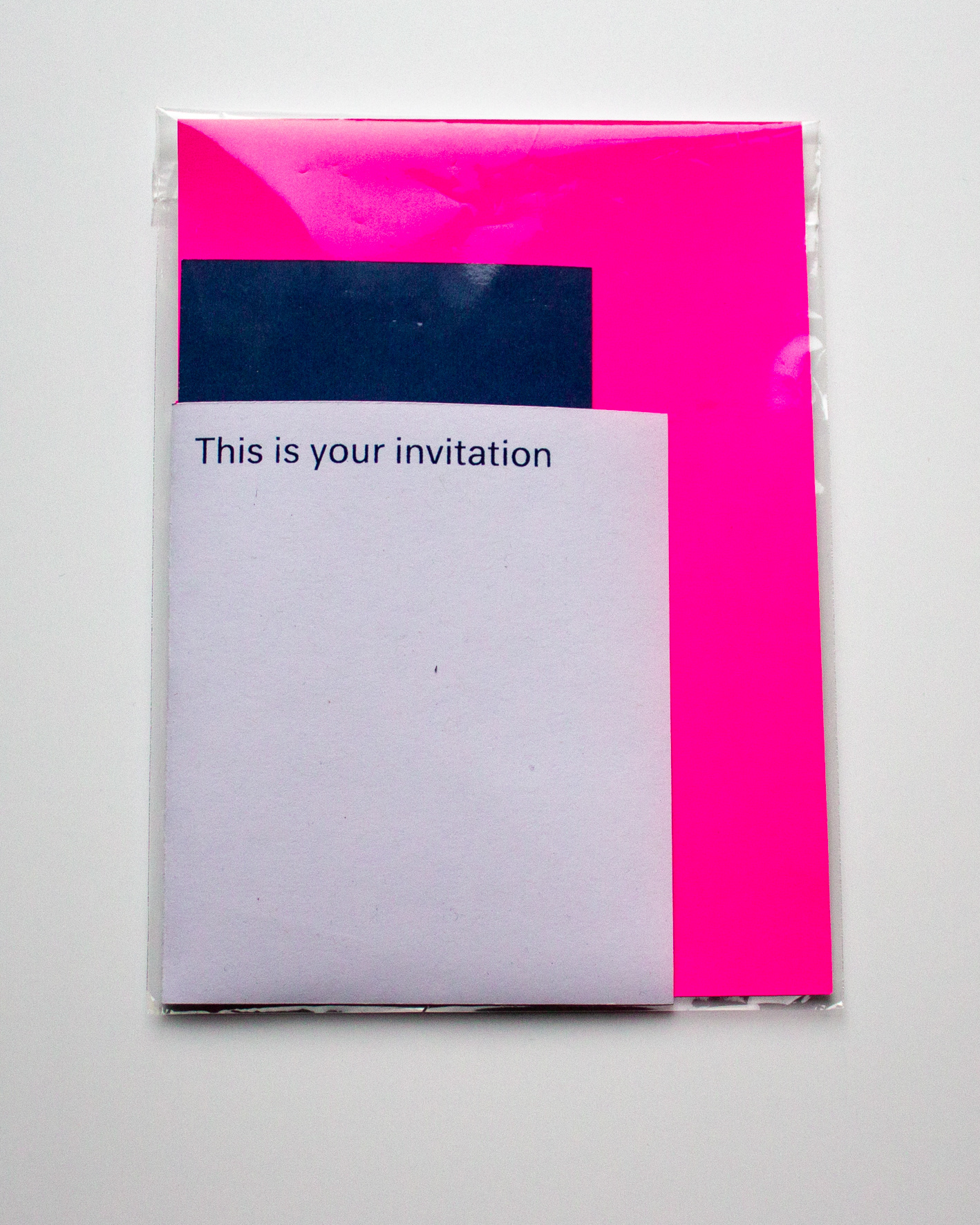
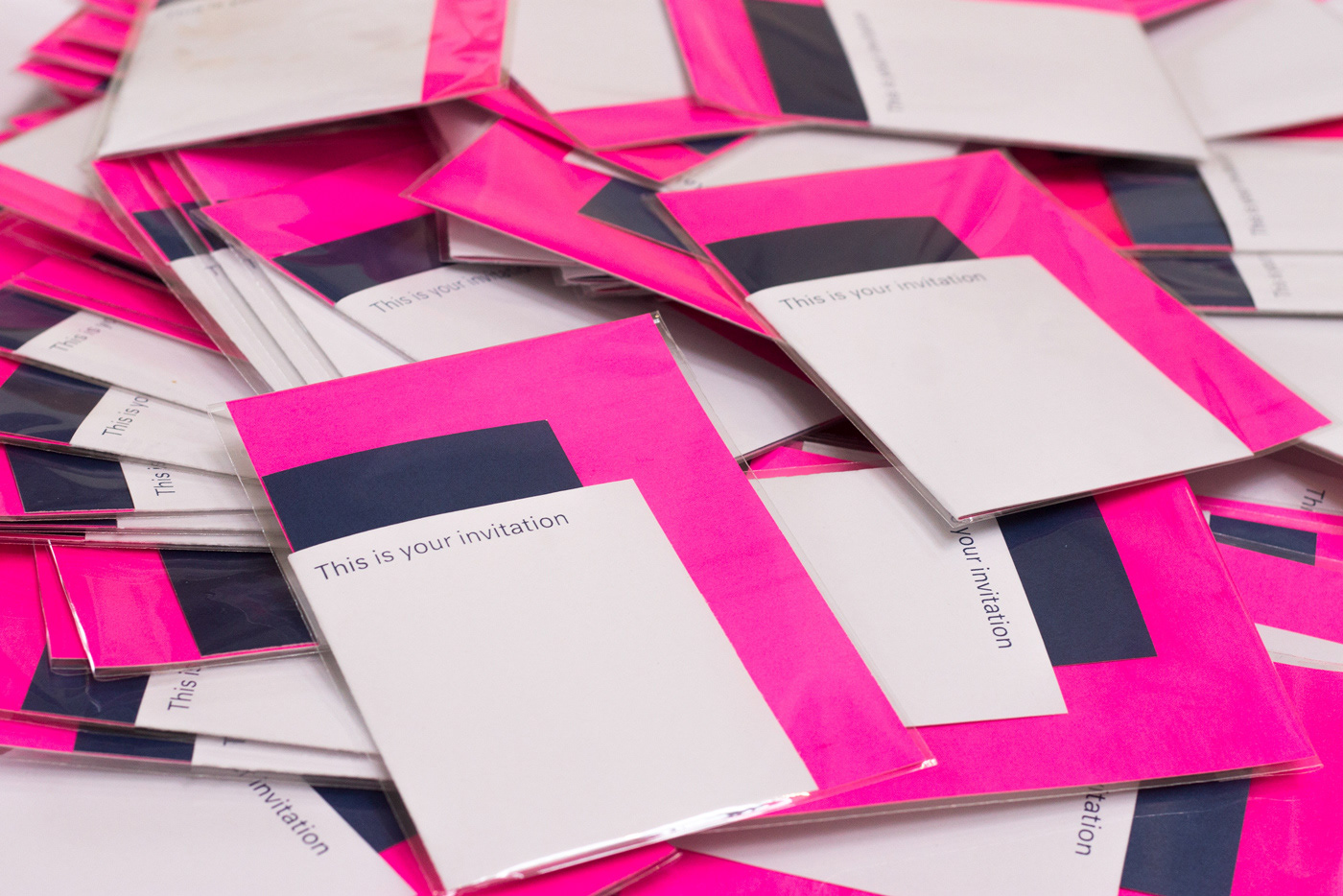
A digital invite was also created as a gif that could be shared freely with family and friends via email and social media.
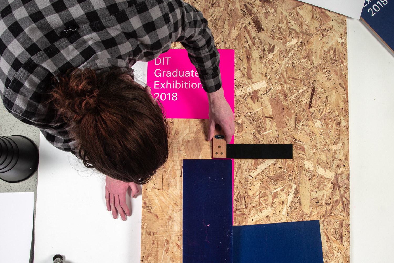
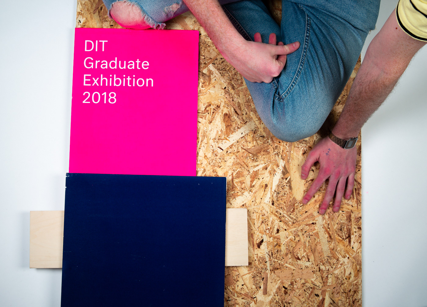
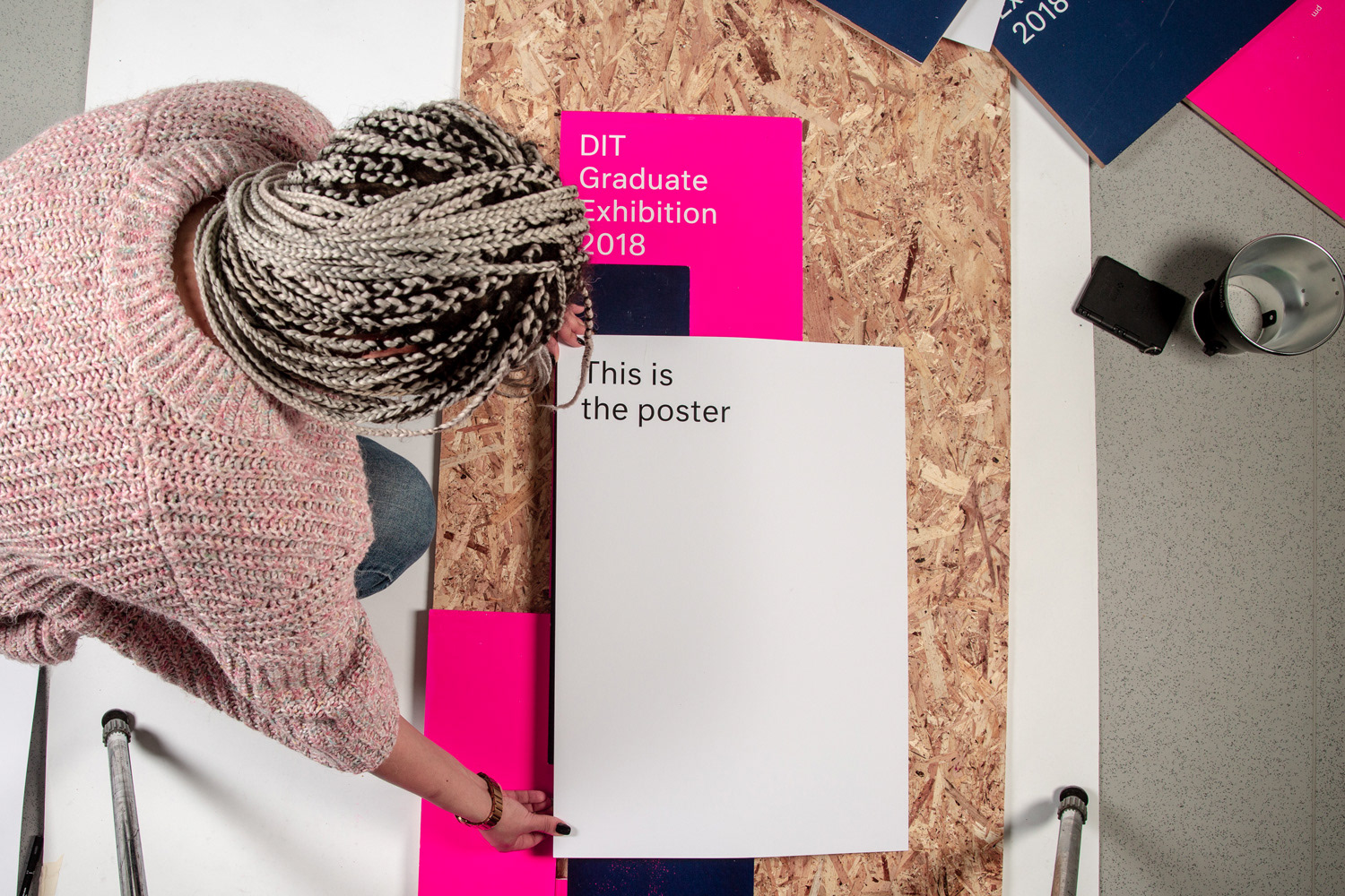
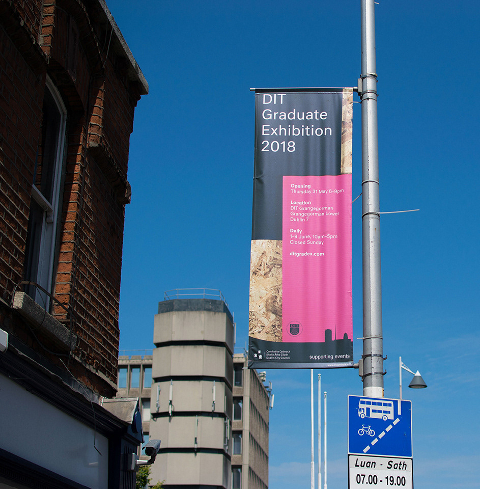
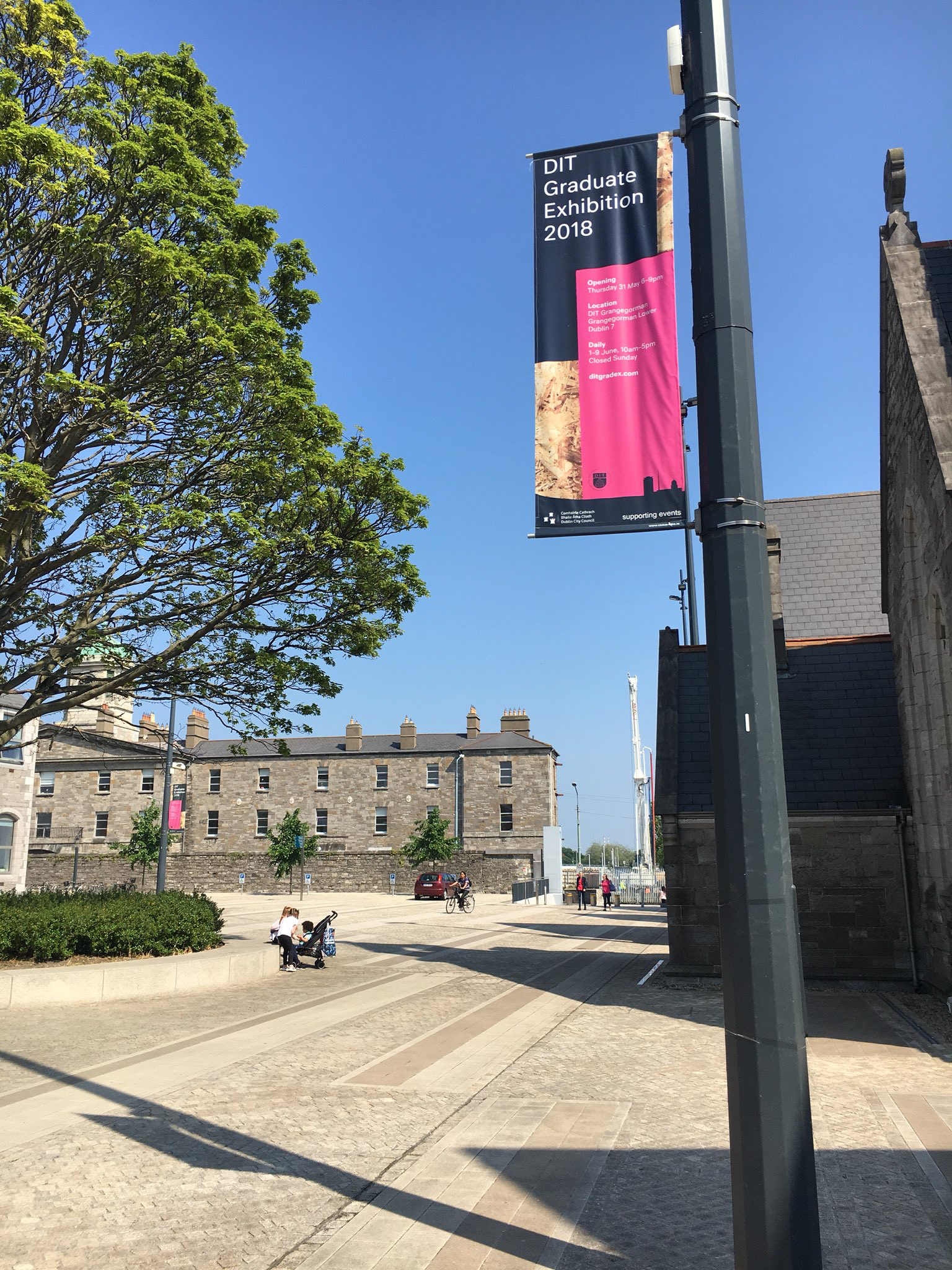
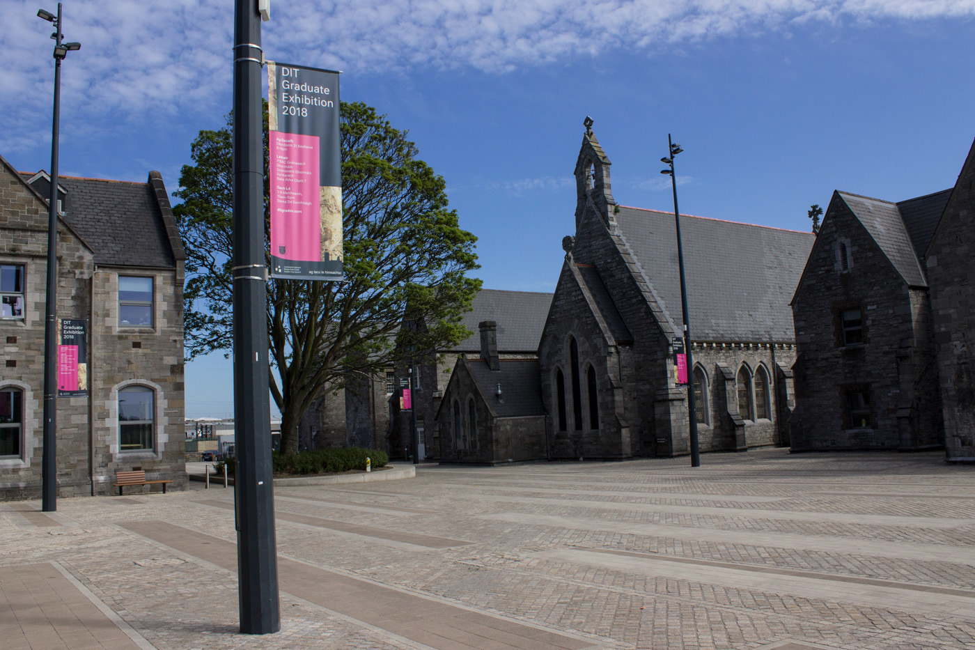
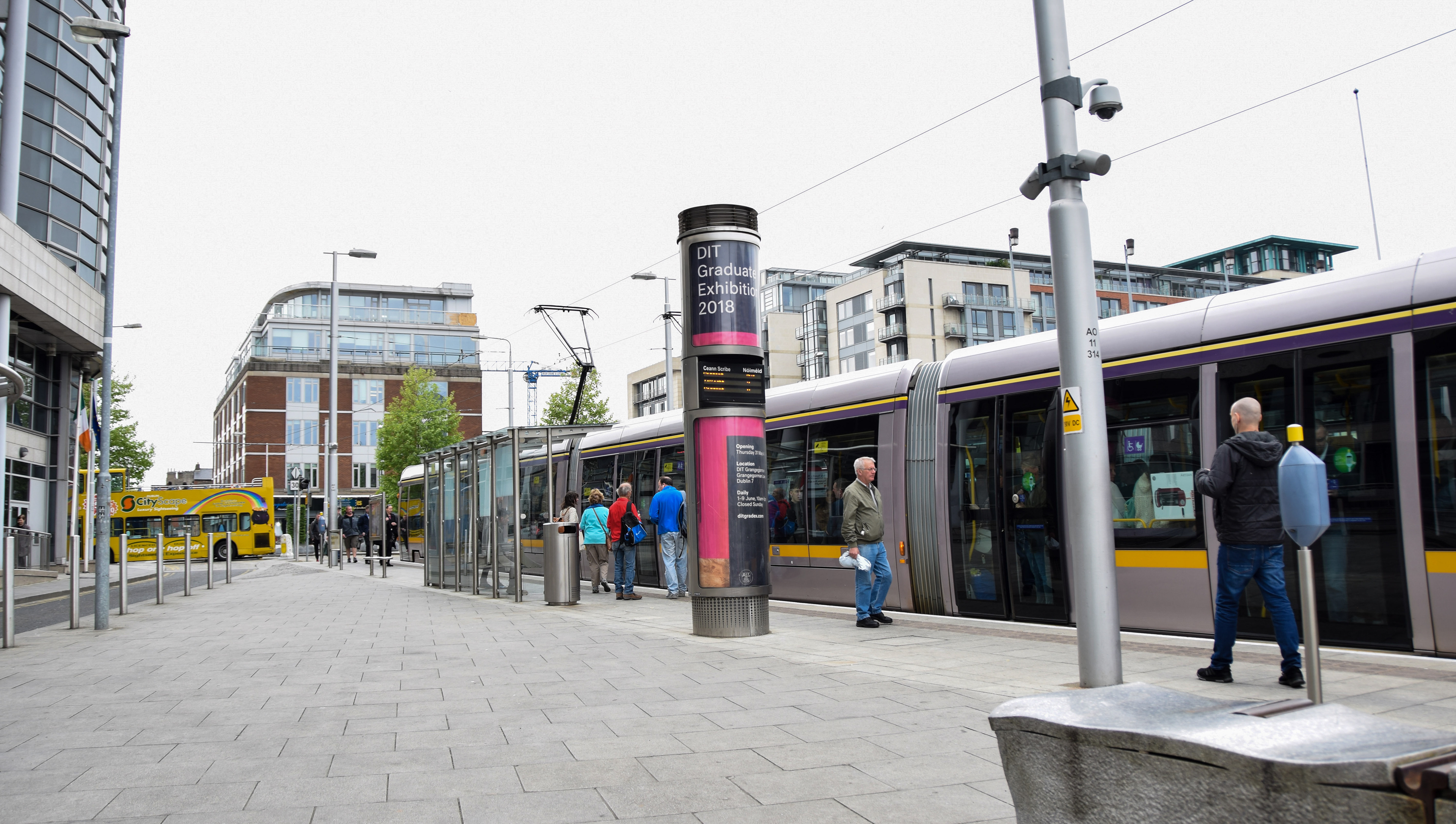
Posters
For the posters we aimed to expand the language of the wayfinding and publication, which told of a process approach. Various materials were overlapped on top of each other to create contrasting compositions of material, texture and colour.
The posters were installed on flagpole banners throughout the Grangegorman campus, the local Smithfield, Phibsborough and Stoneybatter area. Posters also featured at Luas stops and in Hot Press magazine.
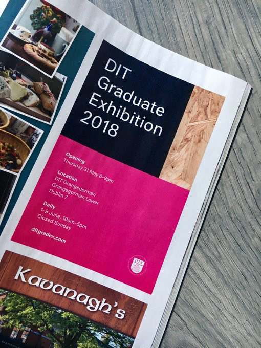
Advertisement which appeared in Hot Press magazine.
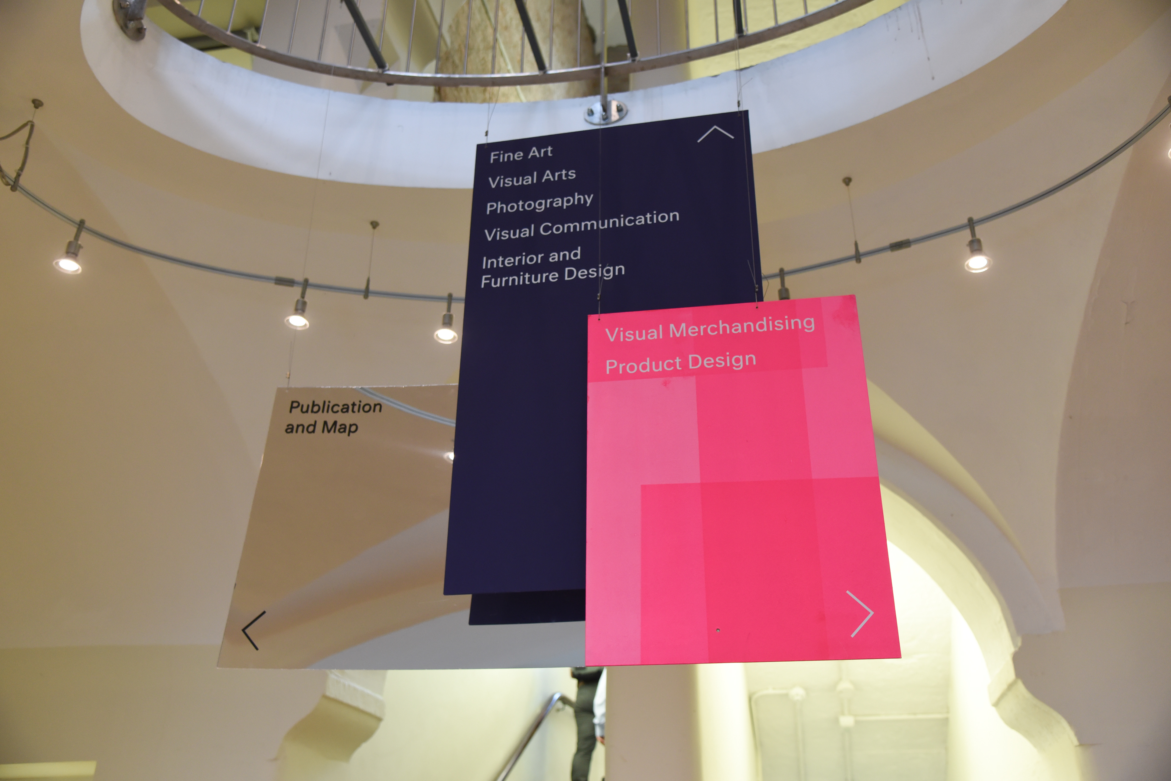
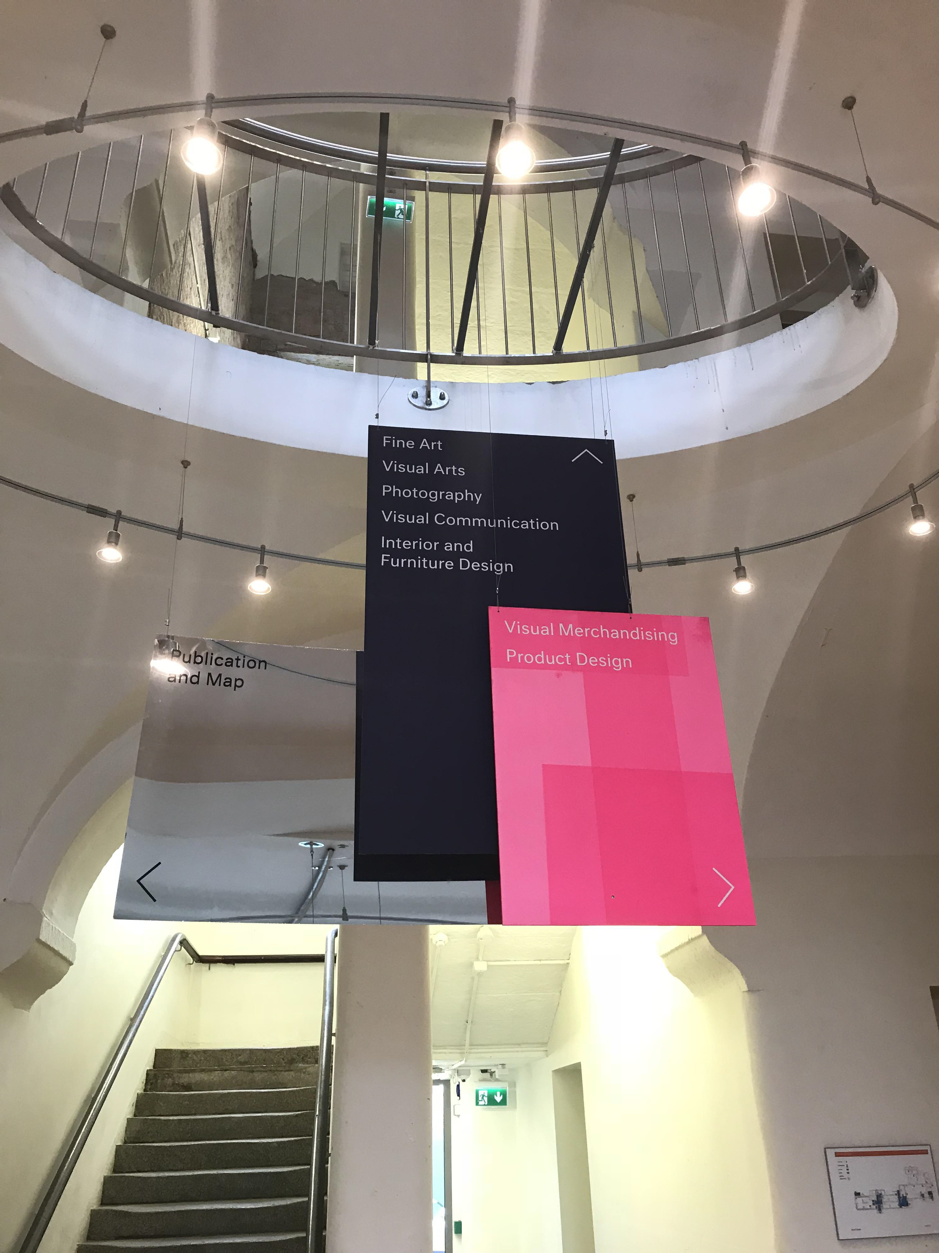
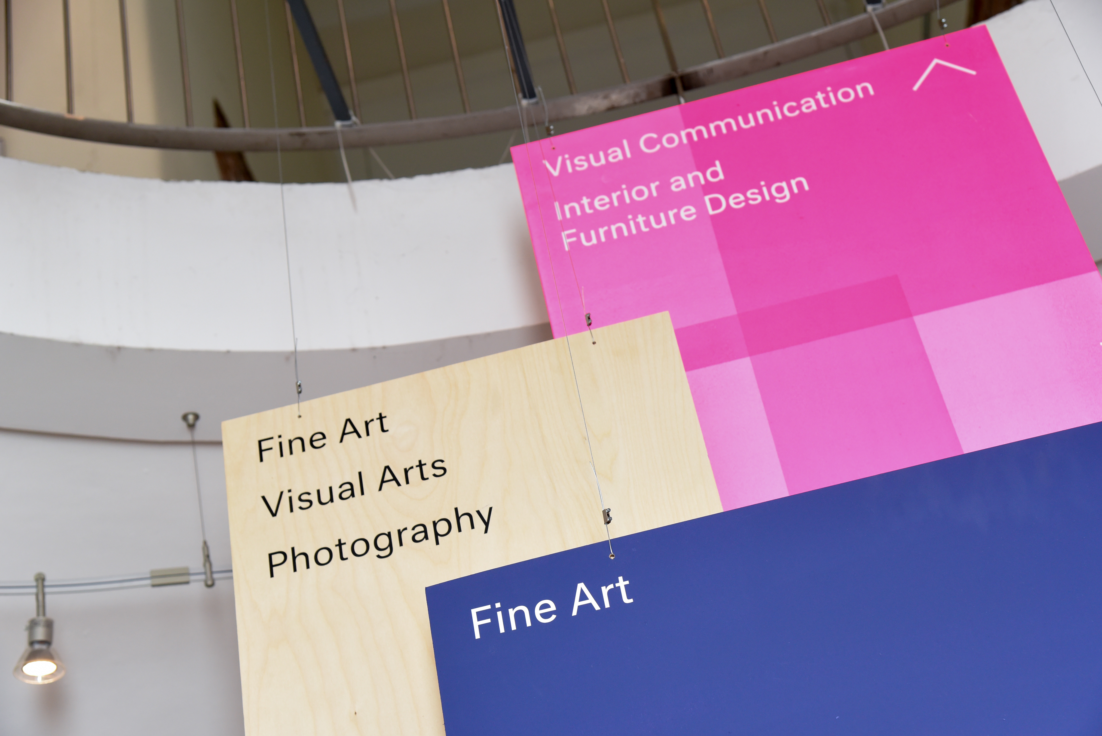
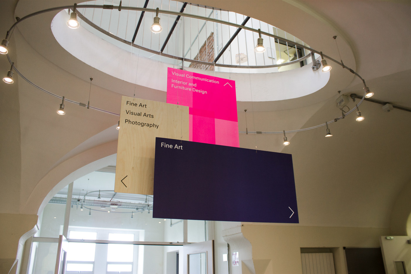
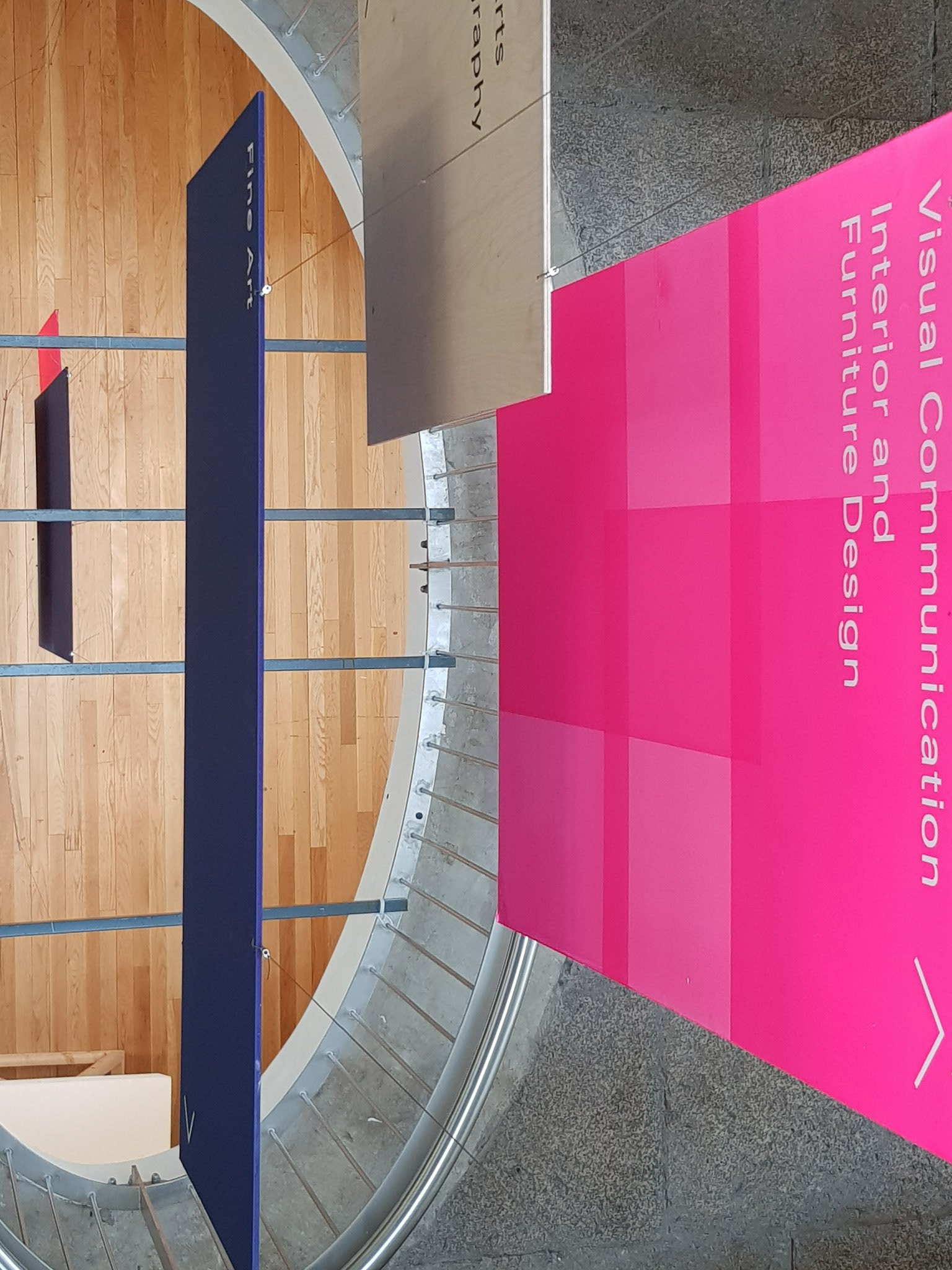
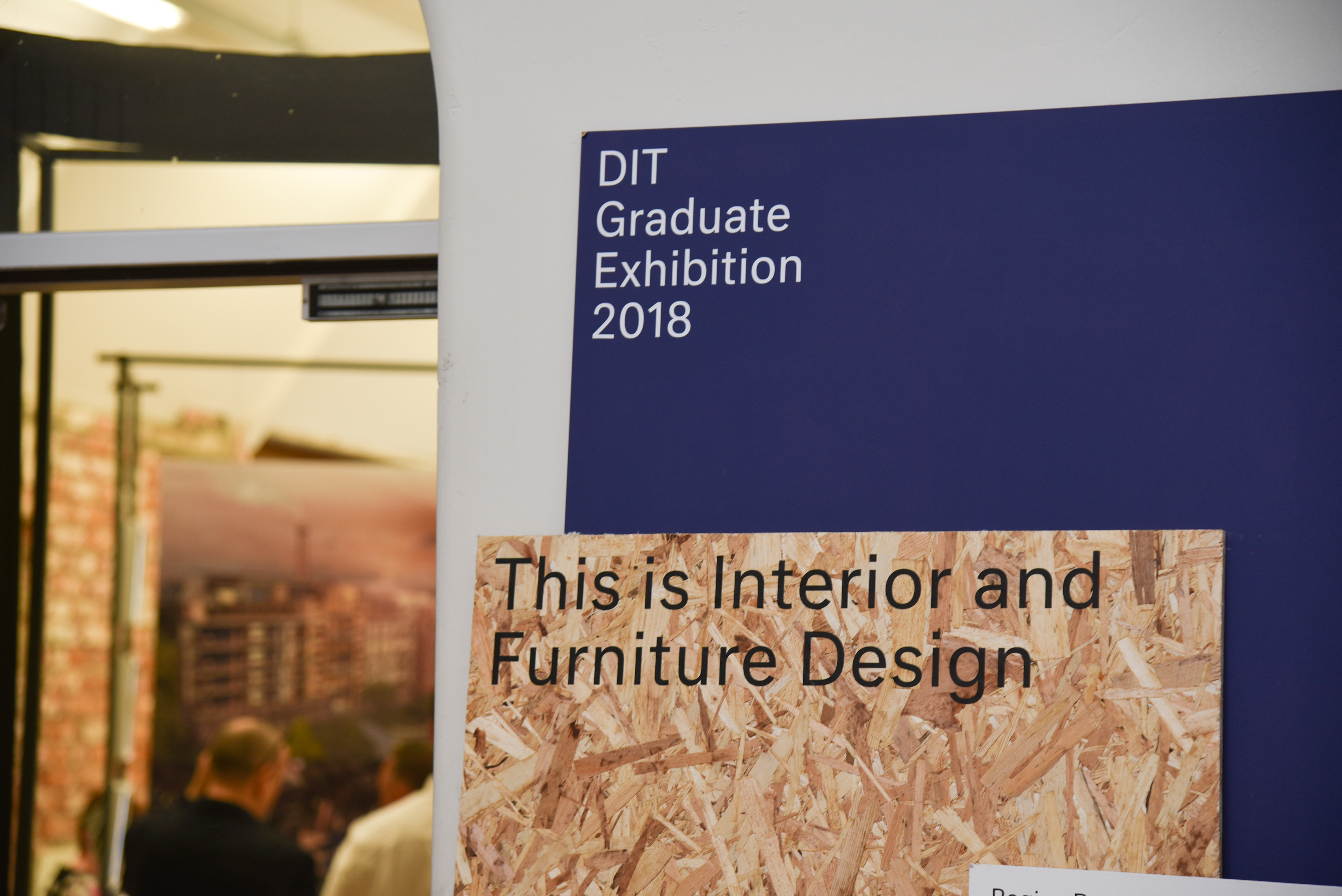
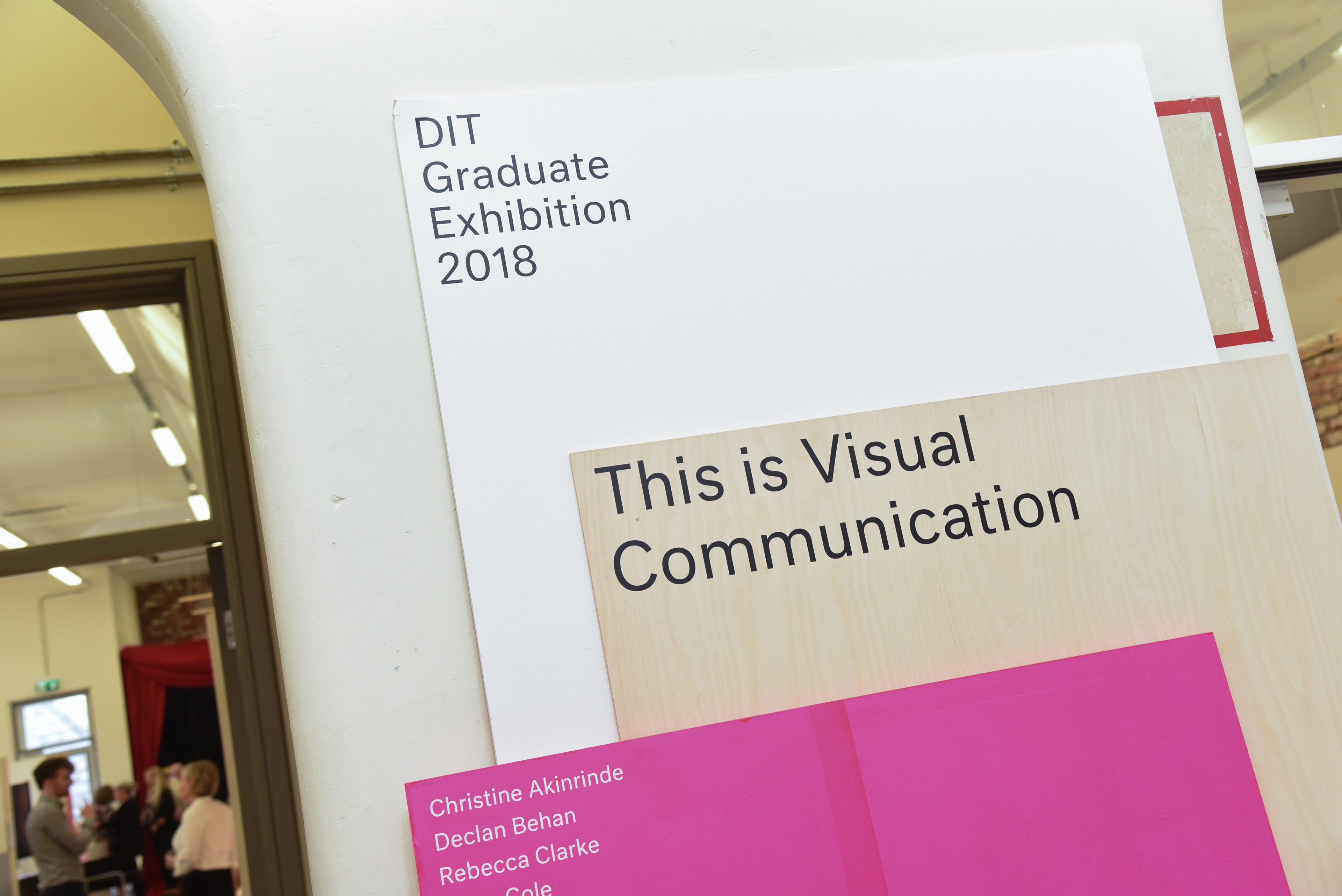
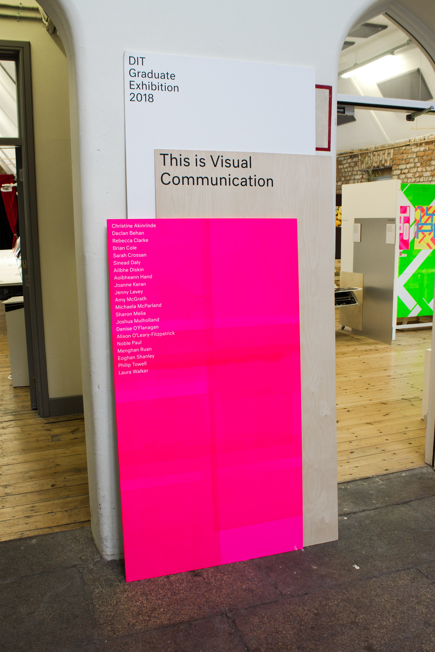
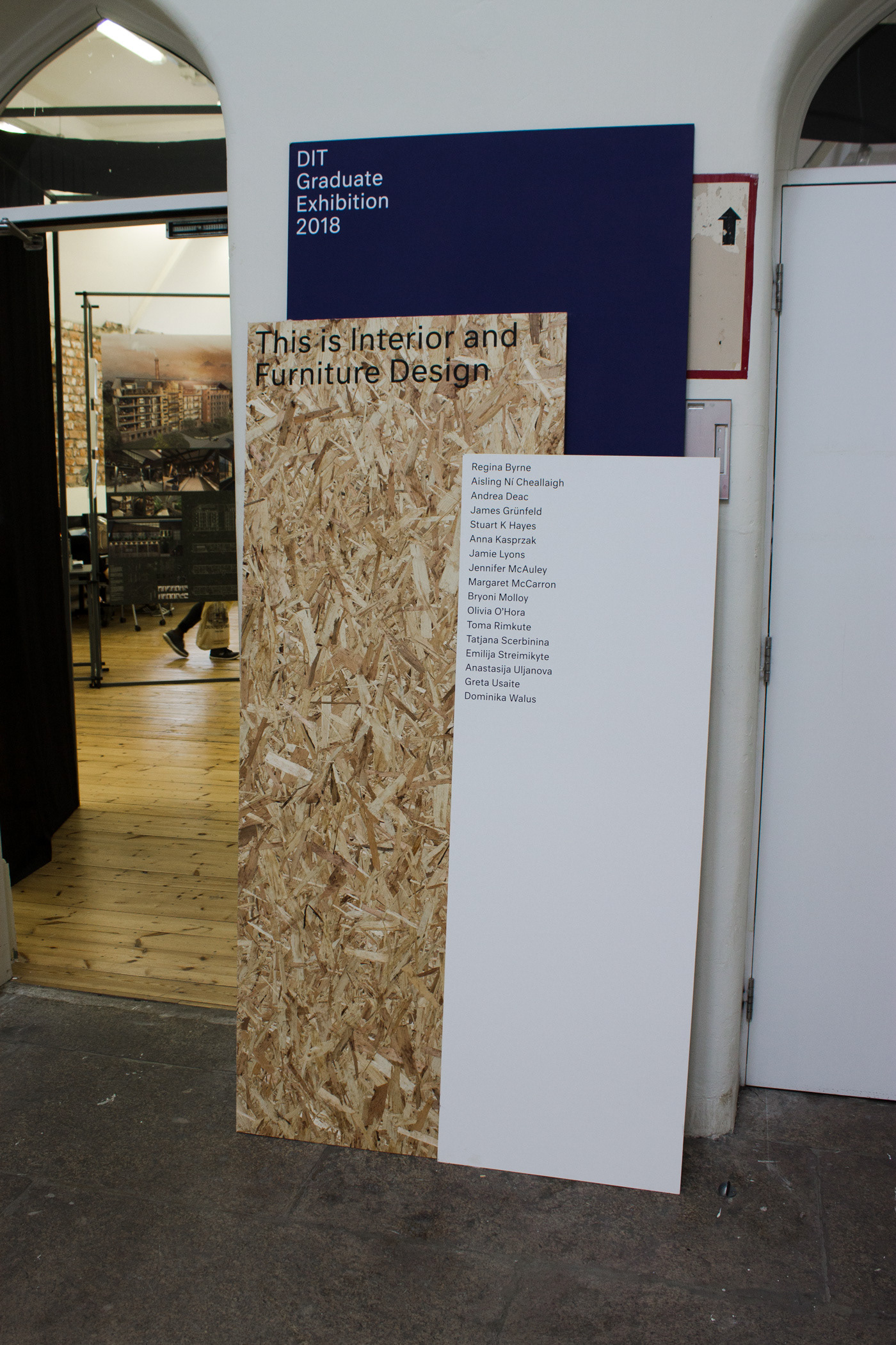
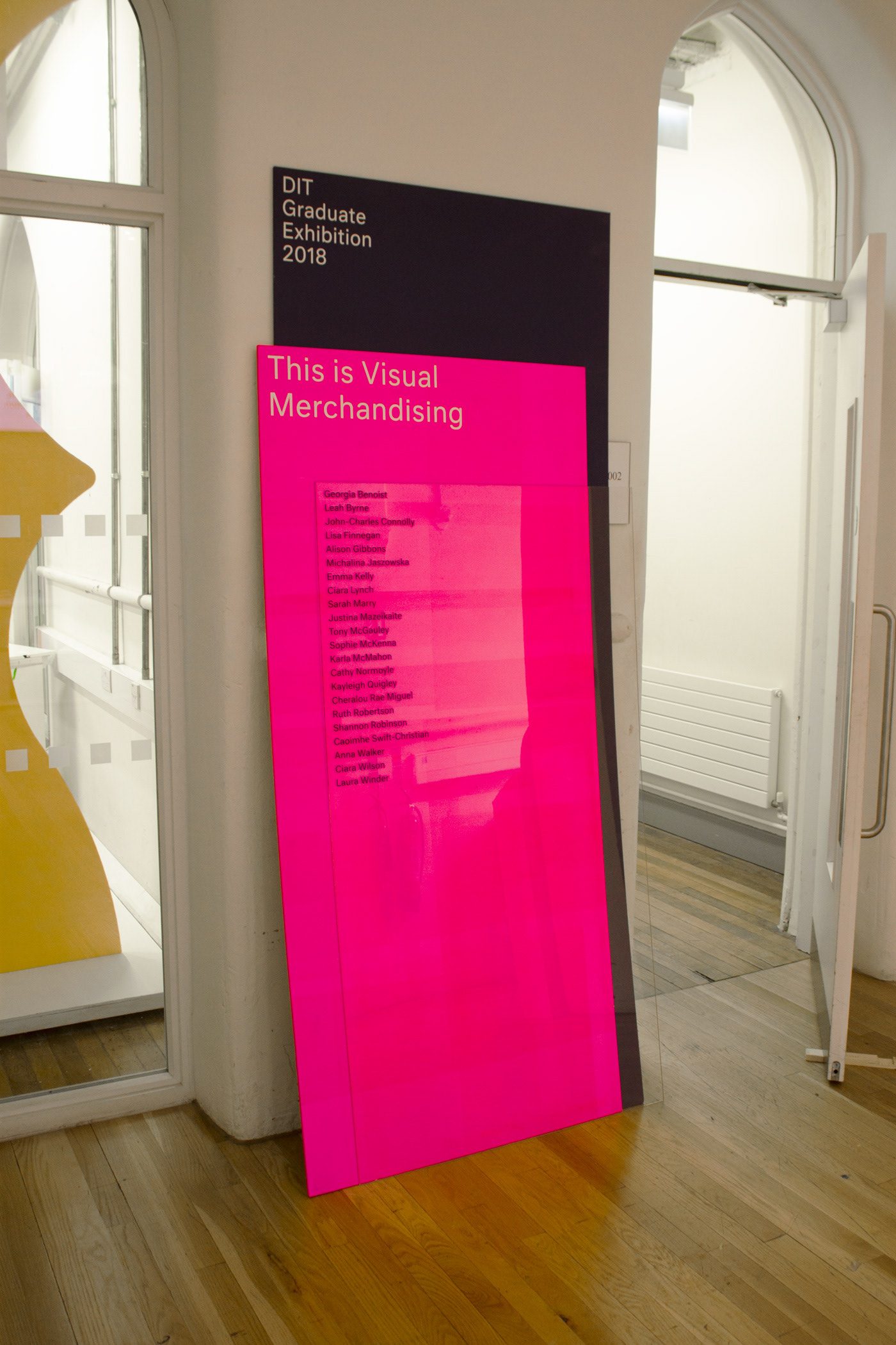
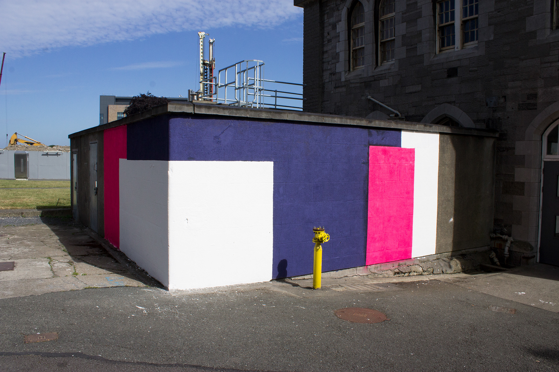
Wayfinding
A wayfinding system was devised to be used throughout the campus and exhibition. The wayfinding consists of a range of overlapping materials in different sizes. Each sign consists of three boards that lean together supporting one another. The materials used range from aluminium, mirror, perspex, acrylic, birch, to OSB. The pink boards were screen printed in several sections to create an overprinting effect.
Social Media
Various ten second long videos were created to be used across social media platforms to promote the exhibition in the run up to the show.
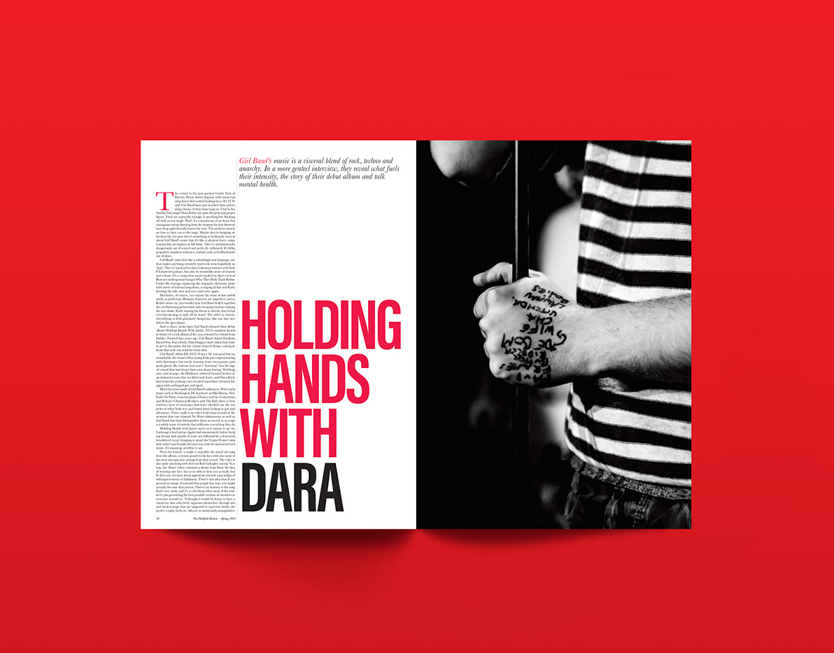
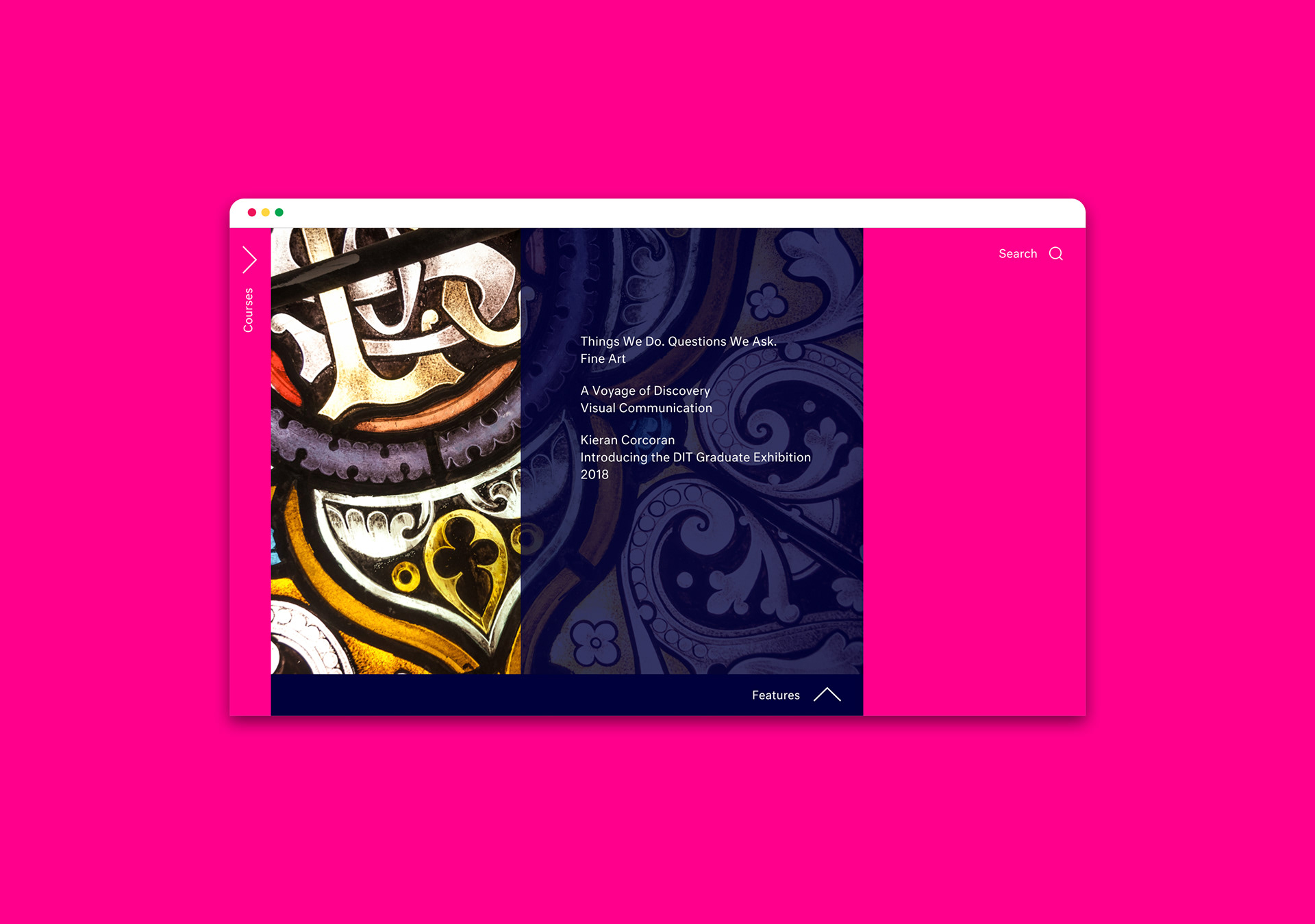
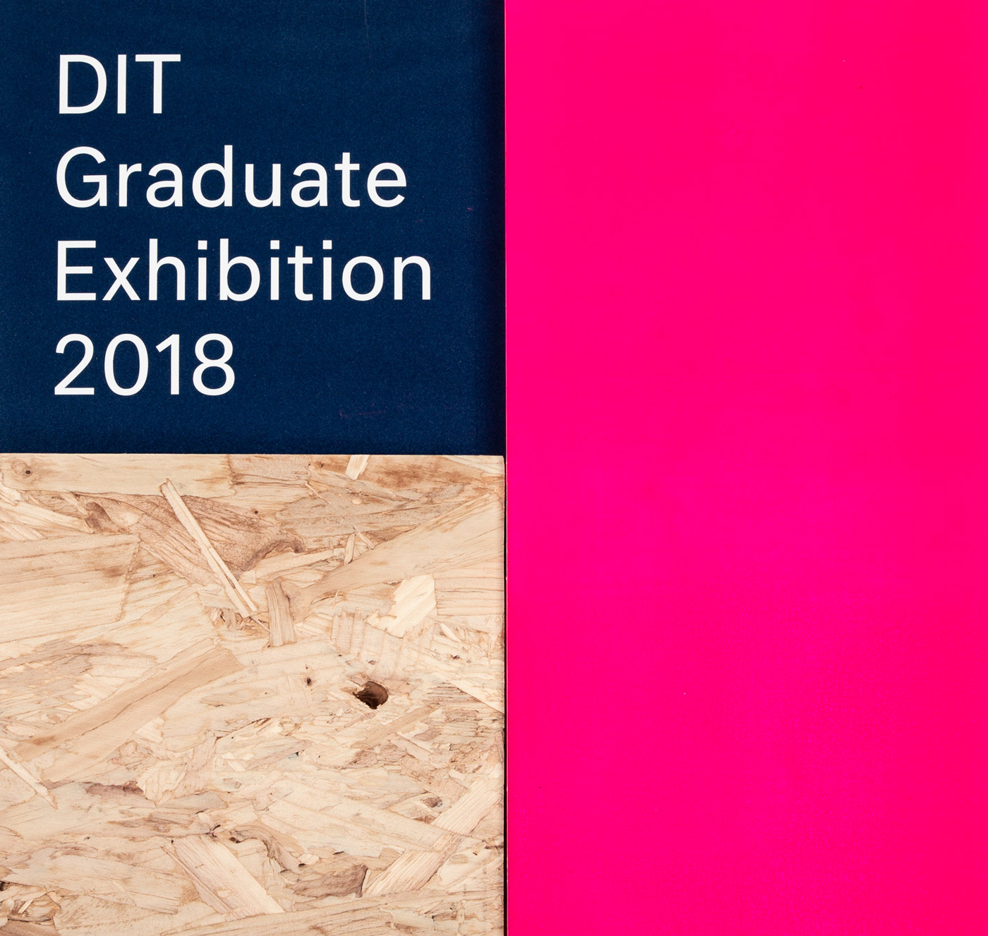
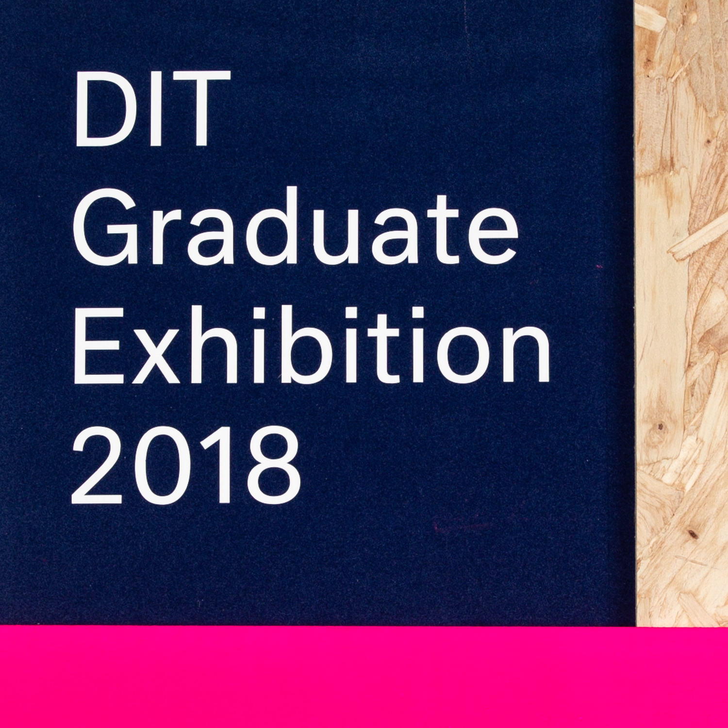
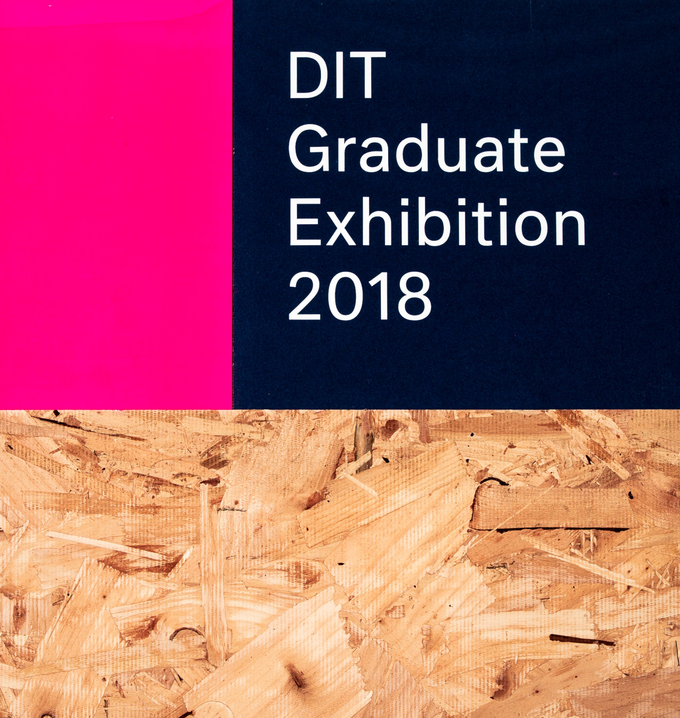
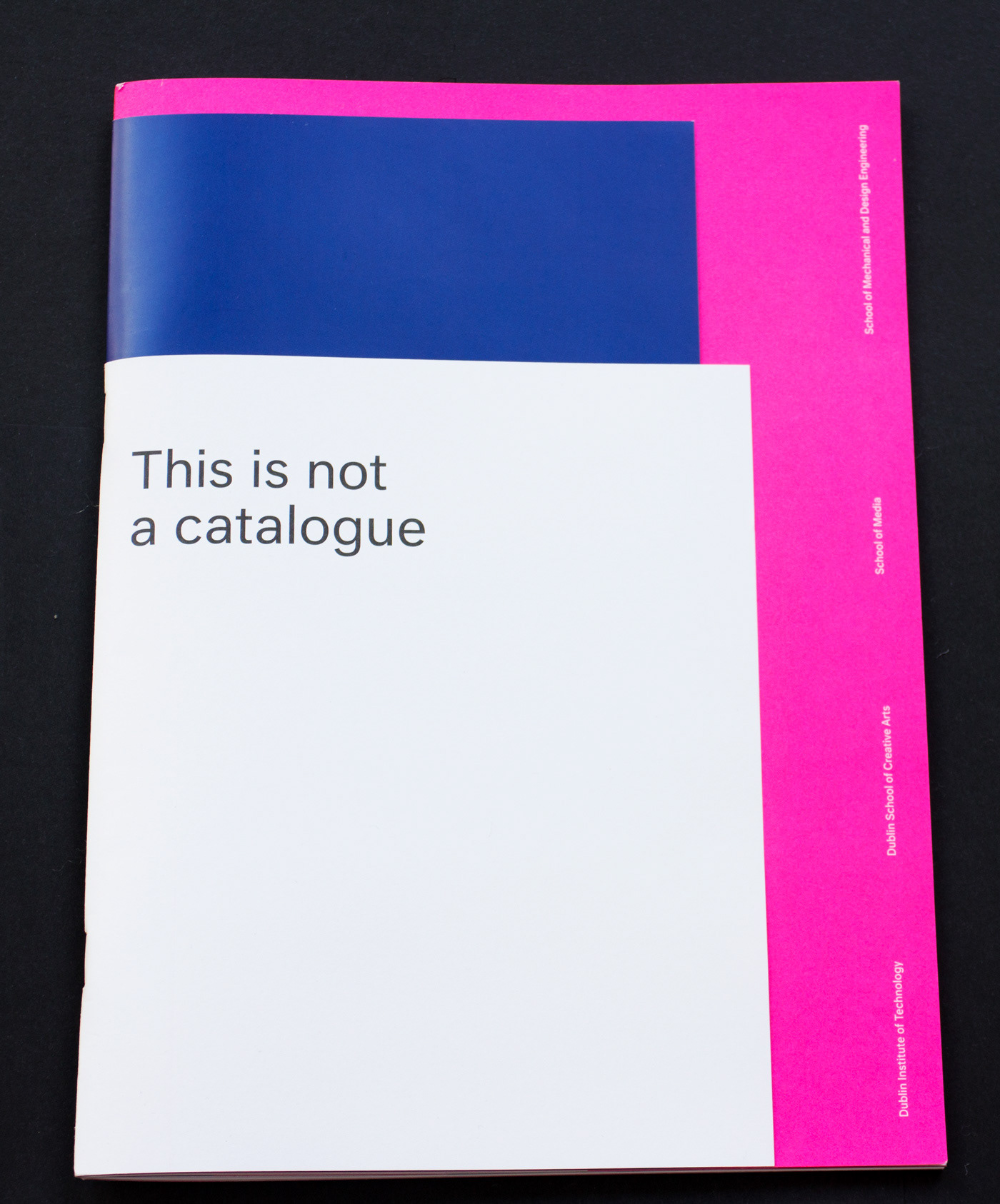
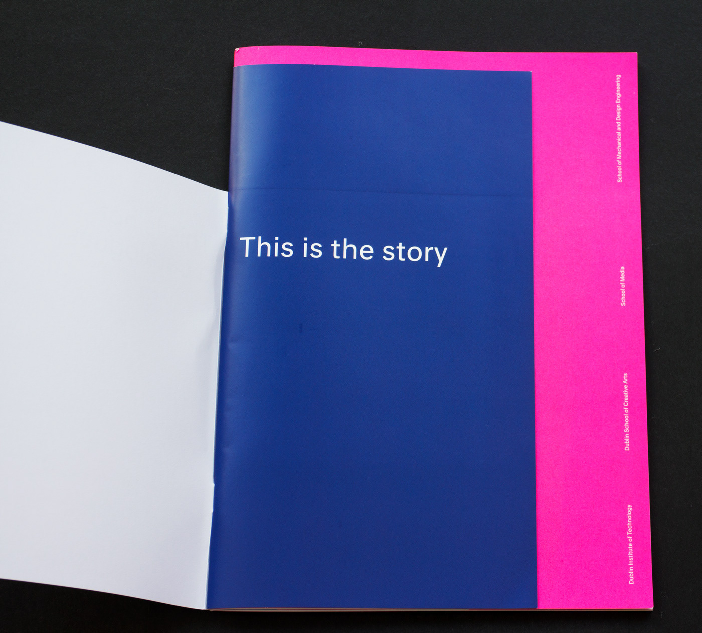
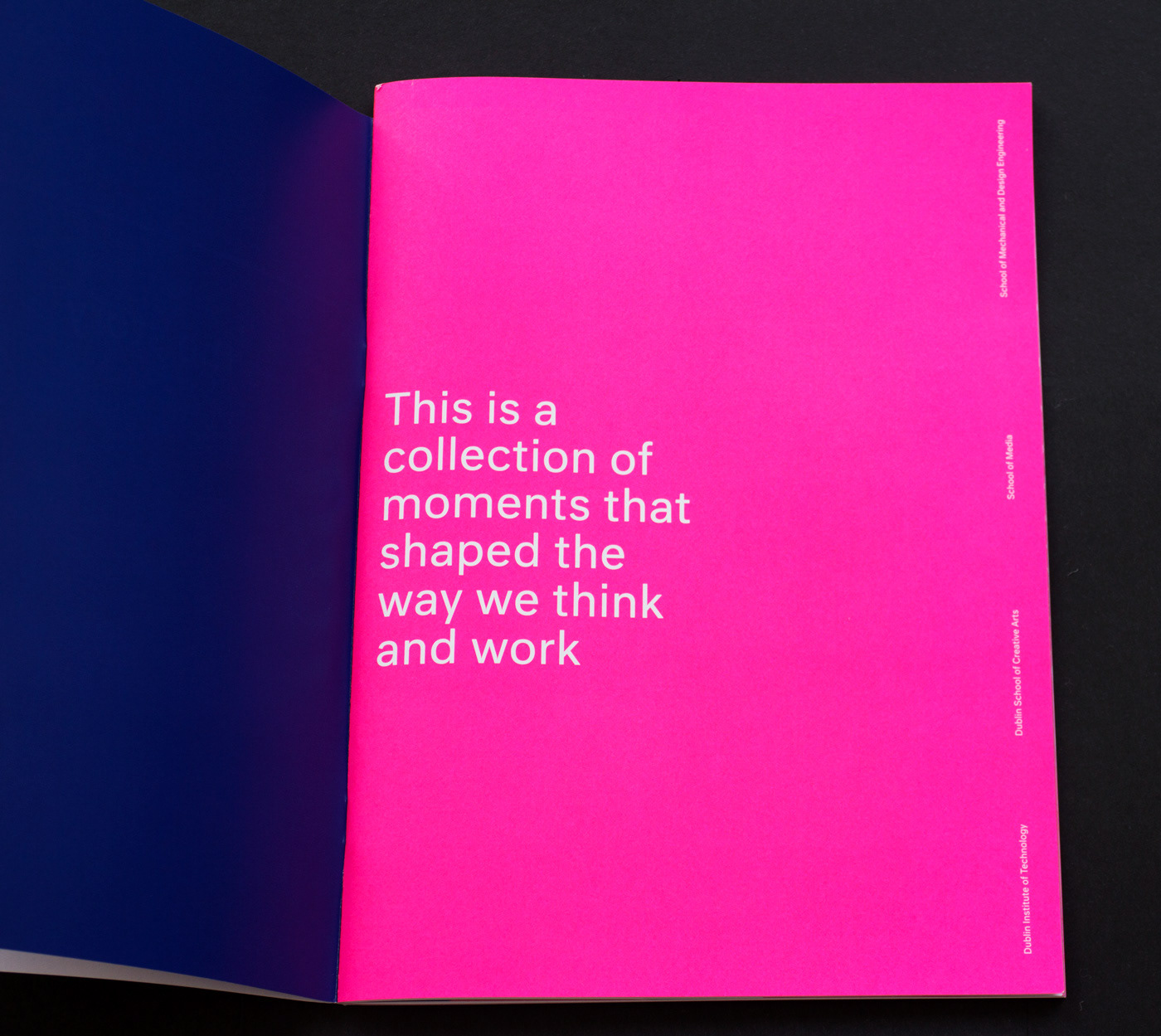
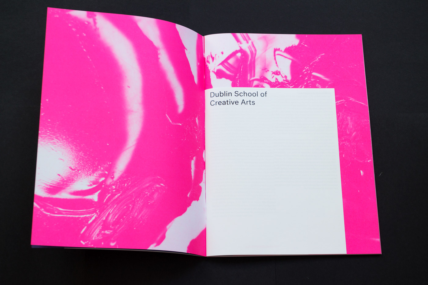
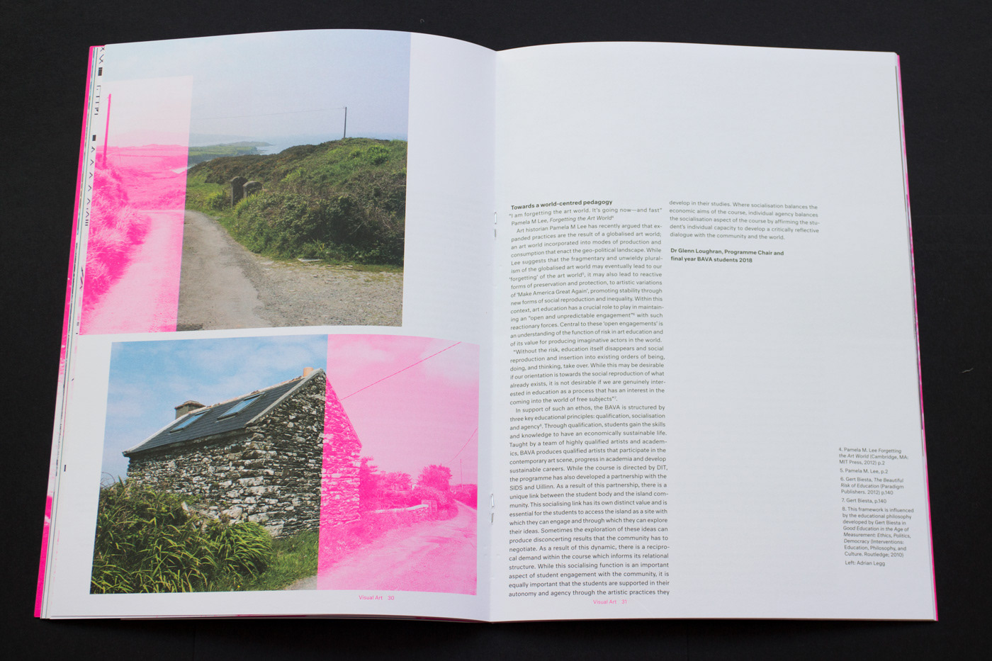
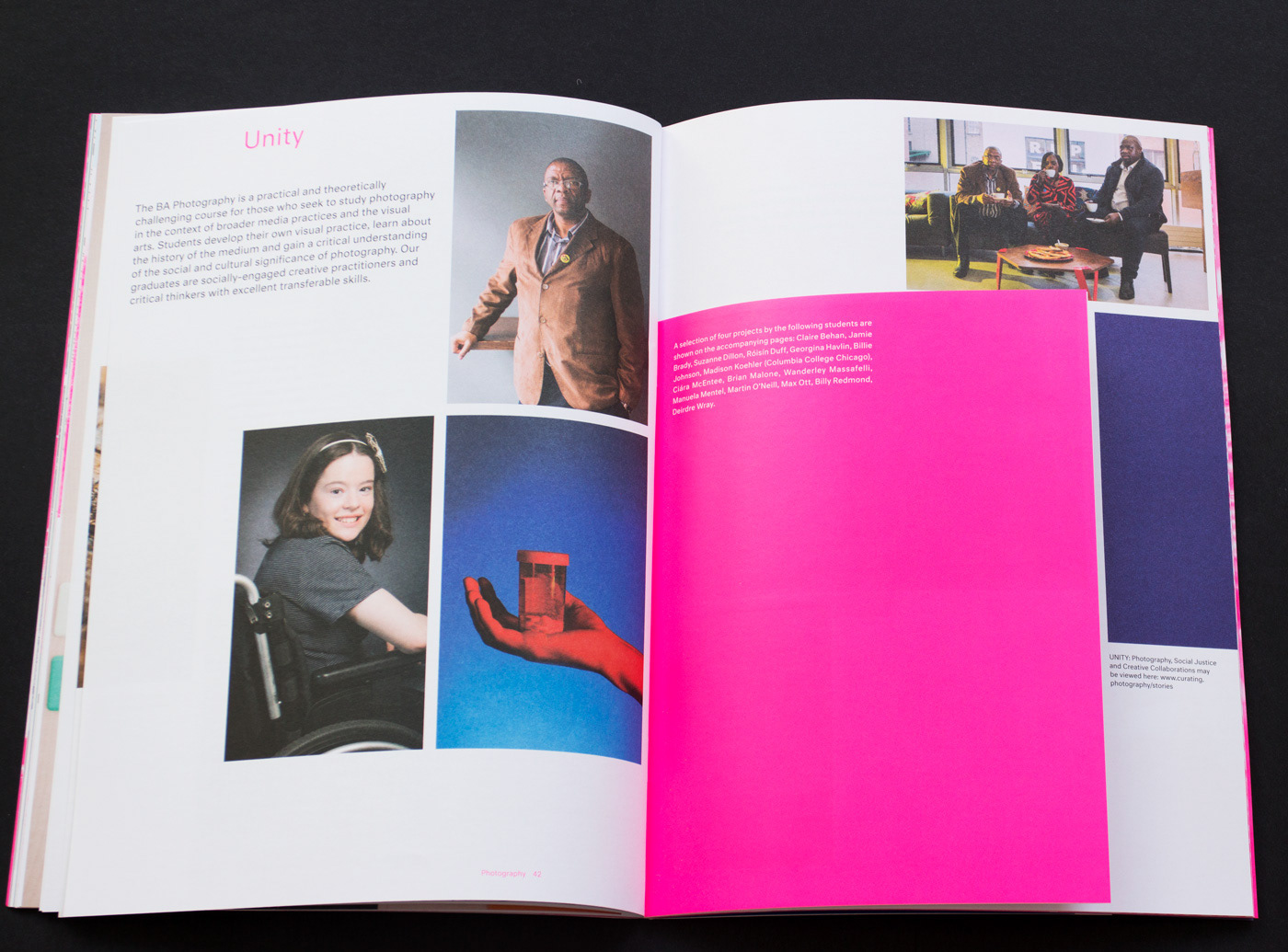
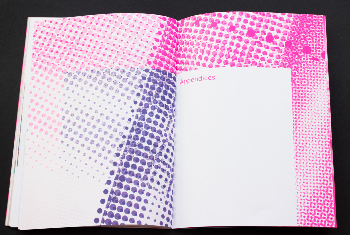
Publication
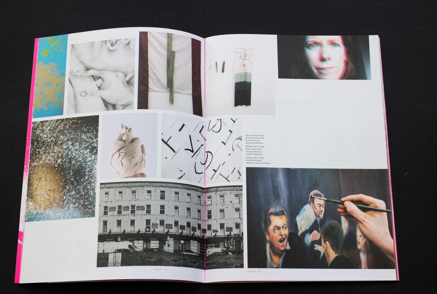
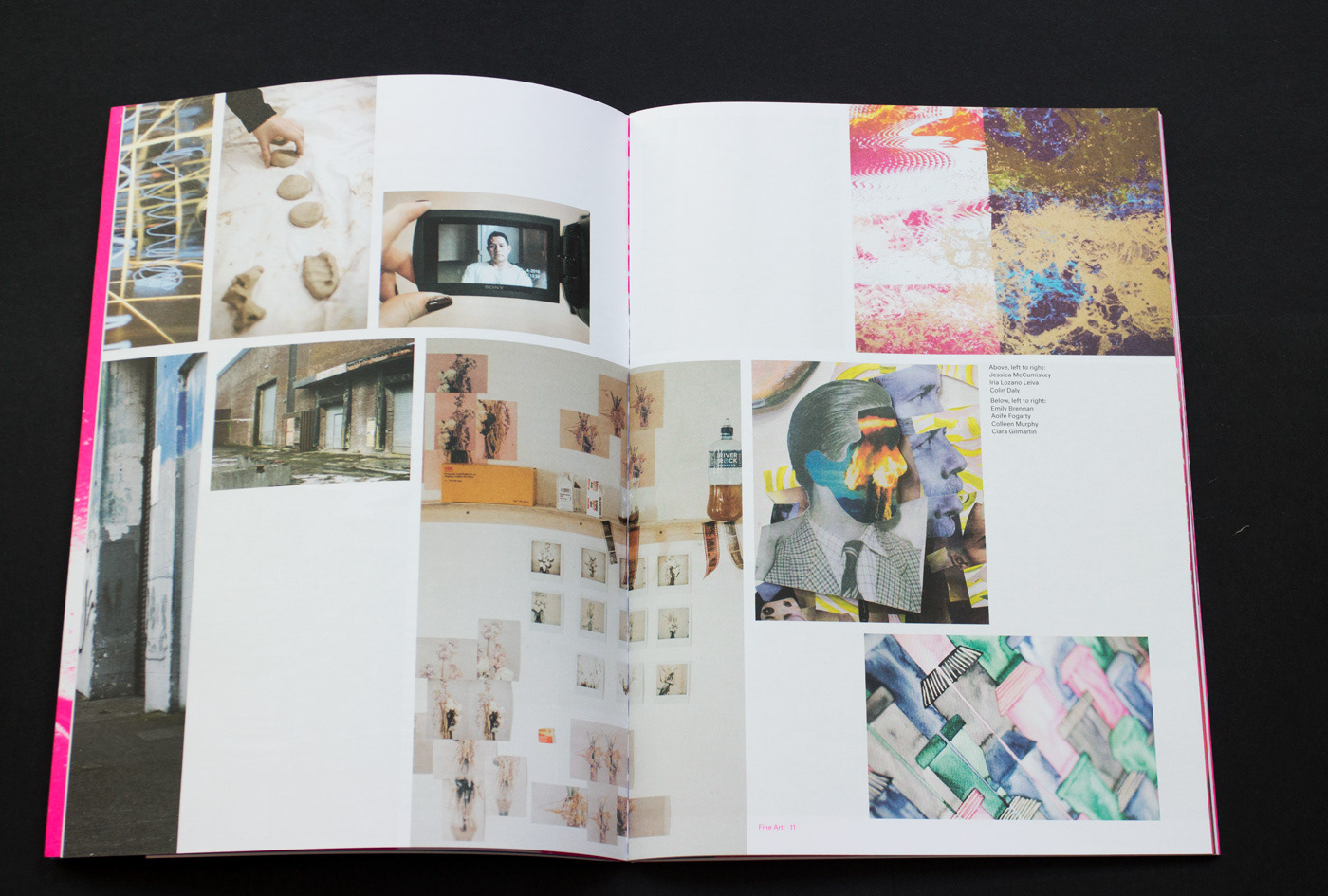
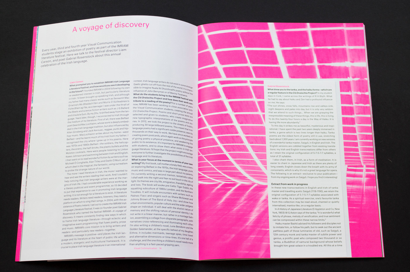
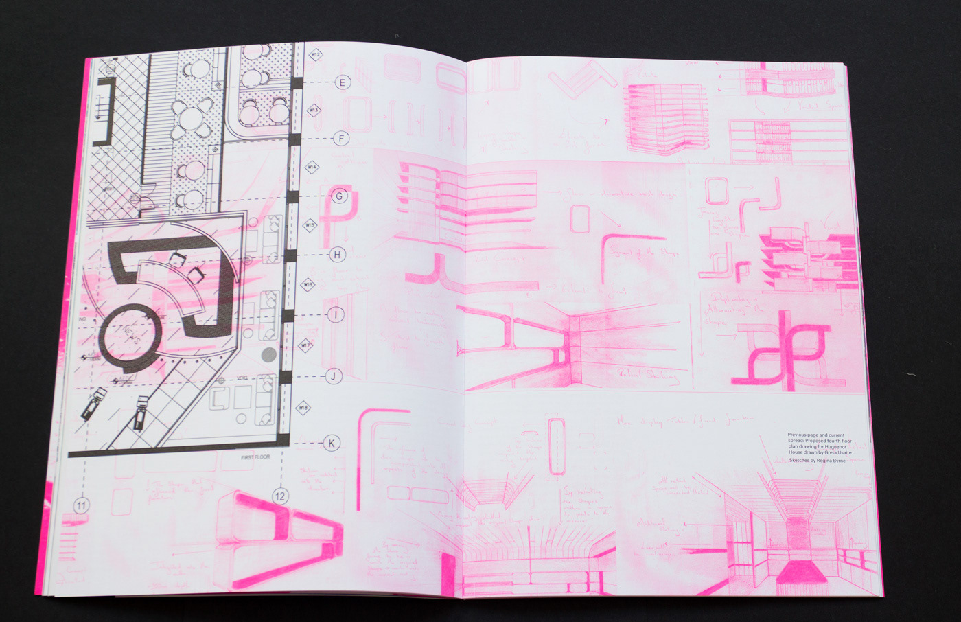
The publication was created to give an insight and behind the scenes look at the courses involved in the exhibition. It contains an article from each course that highlights an important moment or aspect of the course from the graduating classes time at DIT.
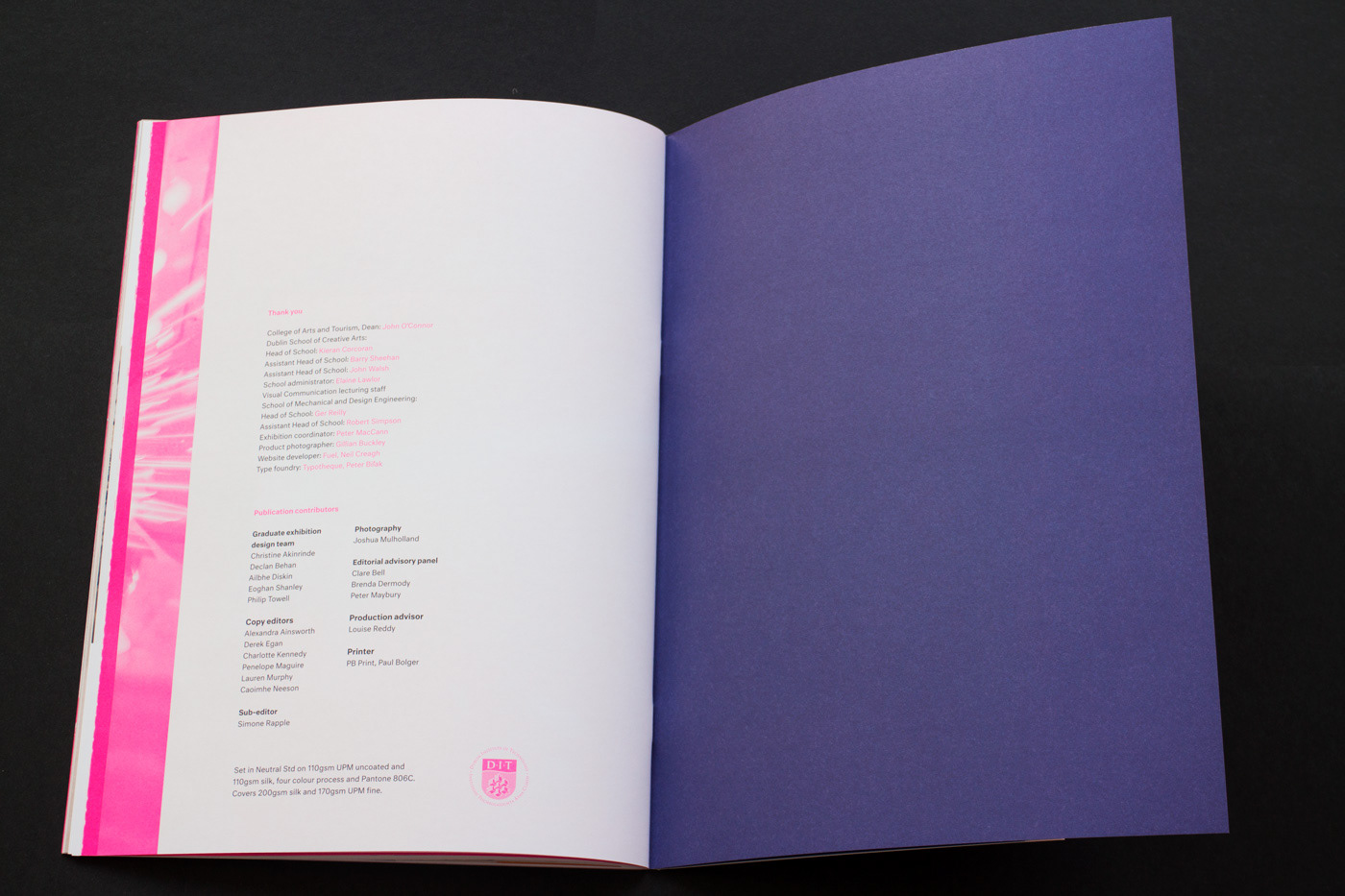
Printed on 110gsm UPM uncoated and 110gsm silk with four colour process and Pantone 806. Covers are printed on 200gsm silk and 170gsm UPM fine. Text set using Neutral Std.
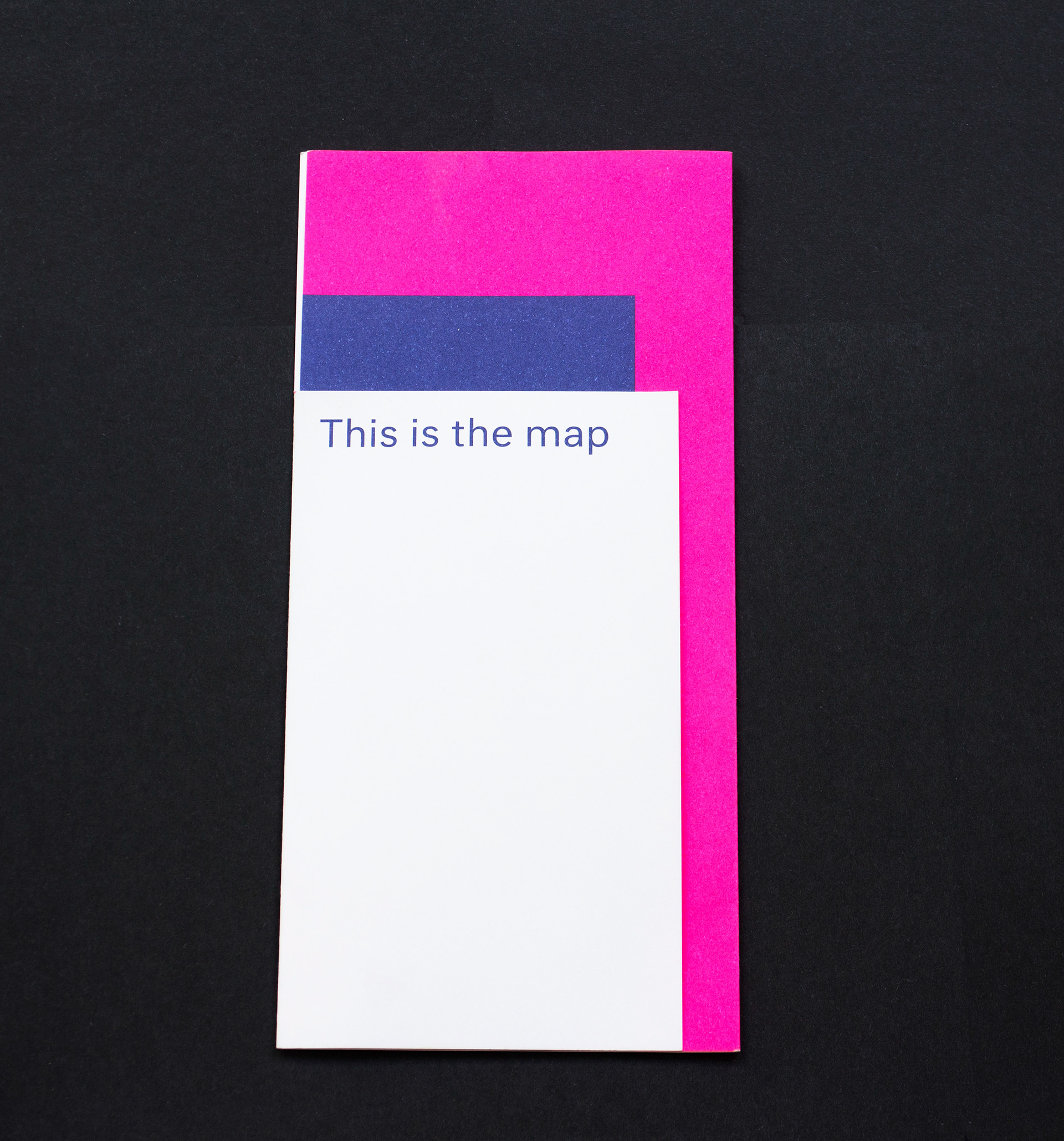
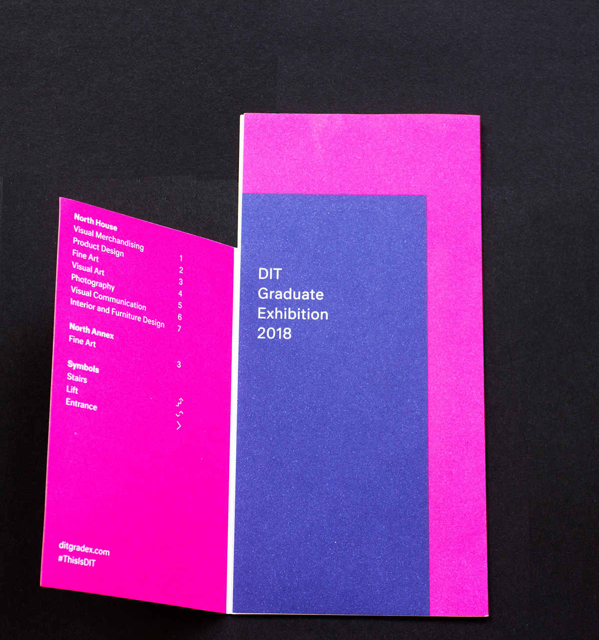
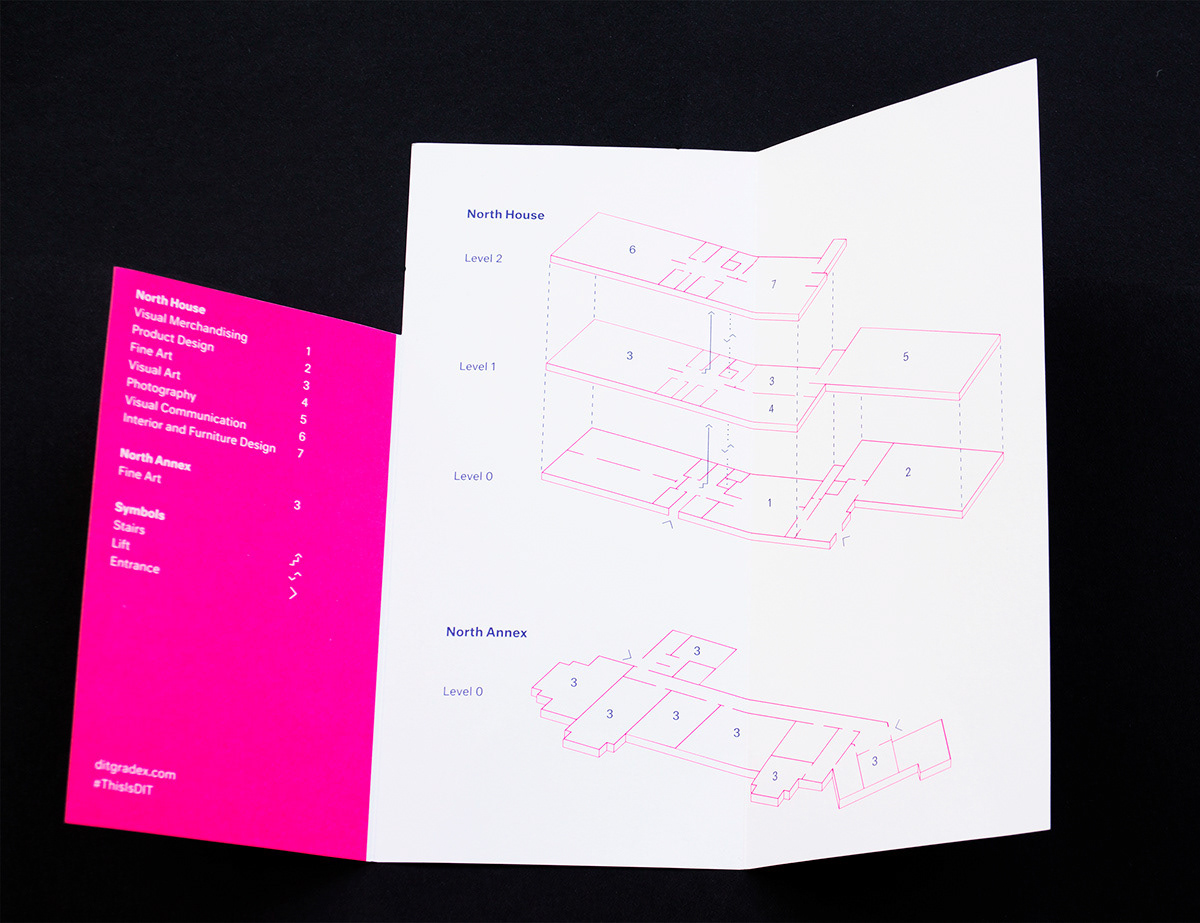
Map
We designed a map that visitors could pick up when they arrived at the exhibition, this would guide them around the entire show pinpointing the various buildings and locations for each course.
The map is a trifold with a die cut and printed on 200gsm uncoated stock in Pantone 806 and Pantone 2756.