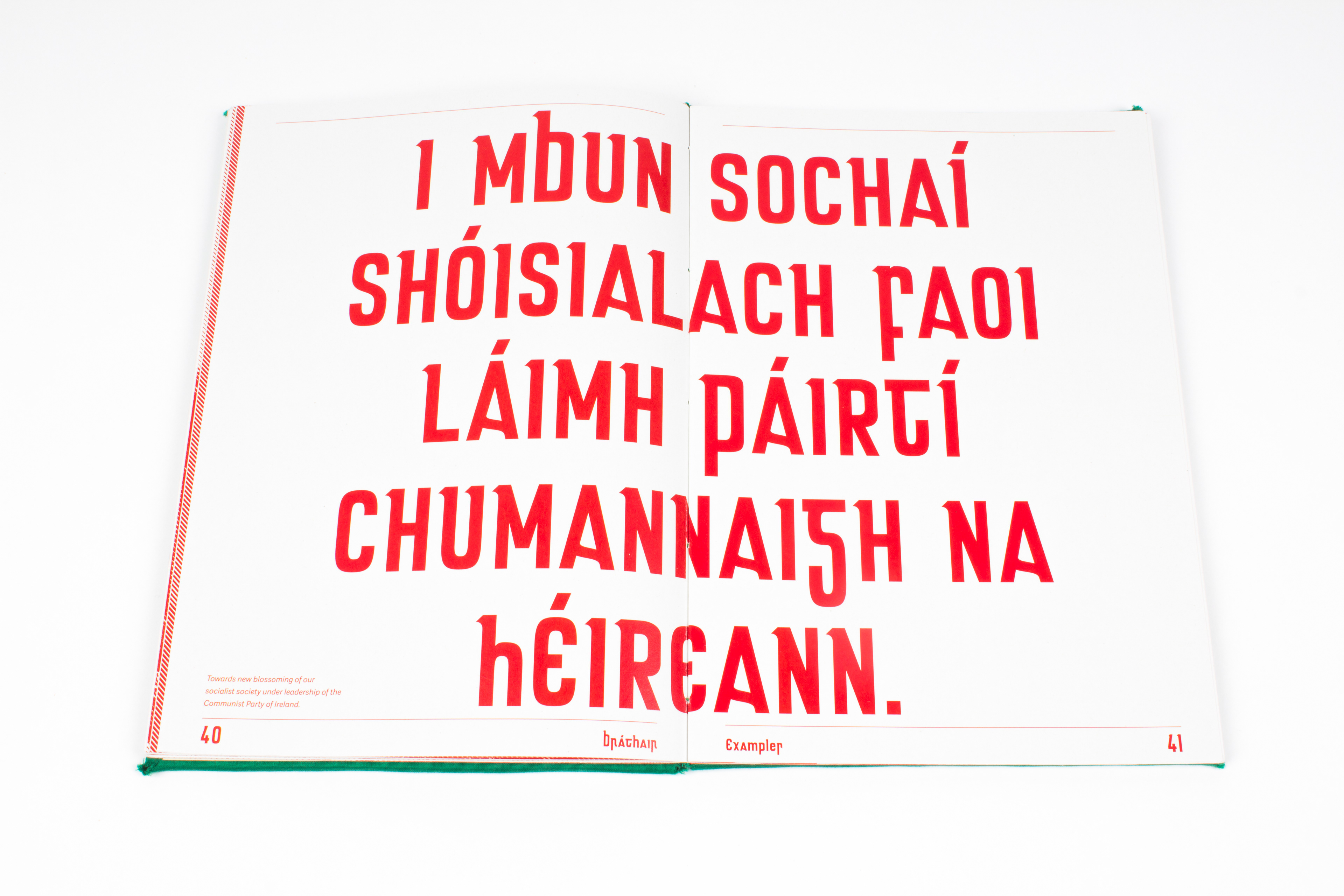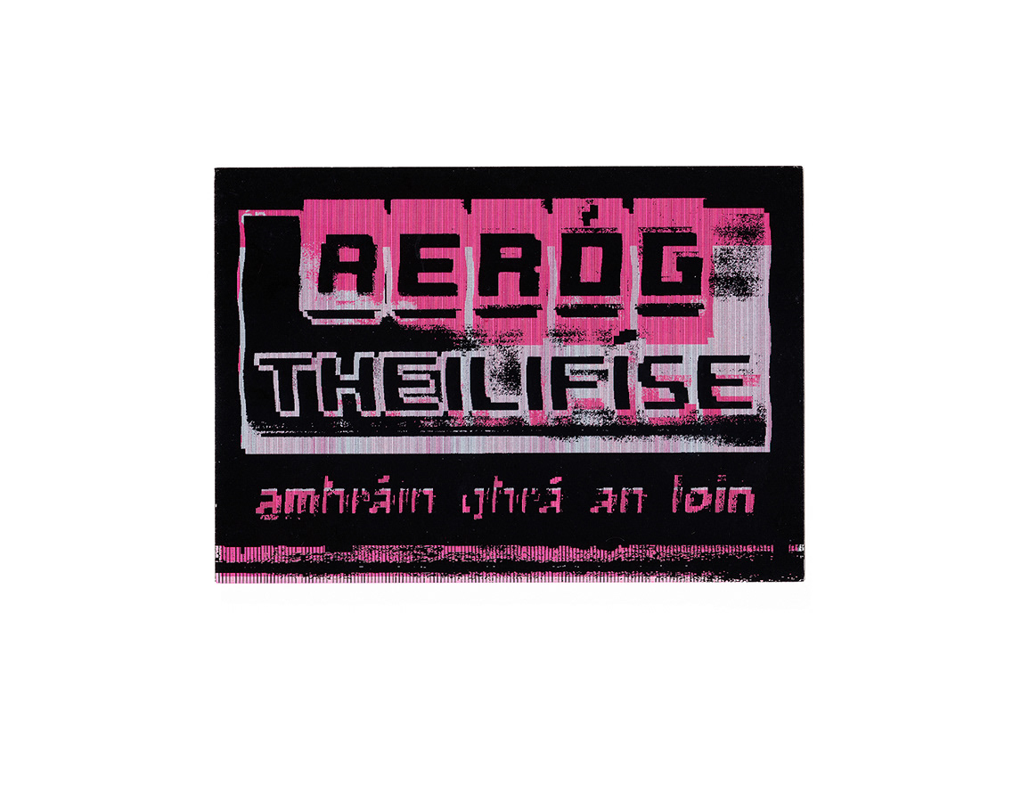
Bráthair is a typeface that combines the characteristics of An Cló Gaelach (Gaelic type) with Slovak typography used on street signs, billboards and shopfronts during the Socialist period, particularly during the period of Normalisation from the 1960—90’s.
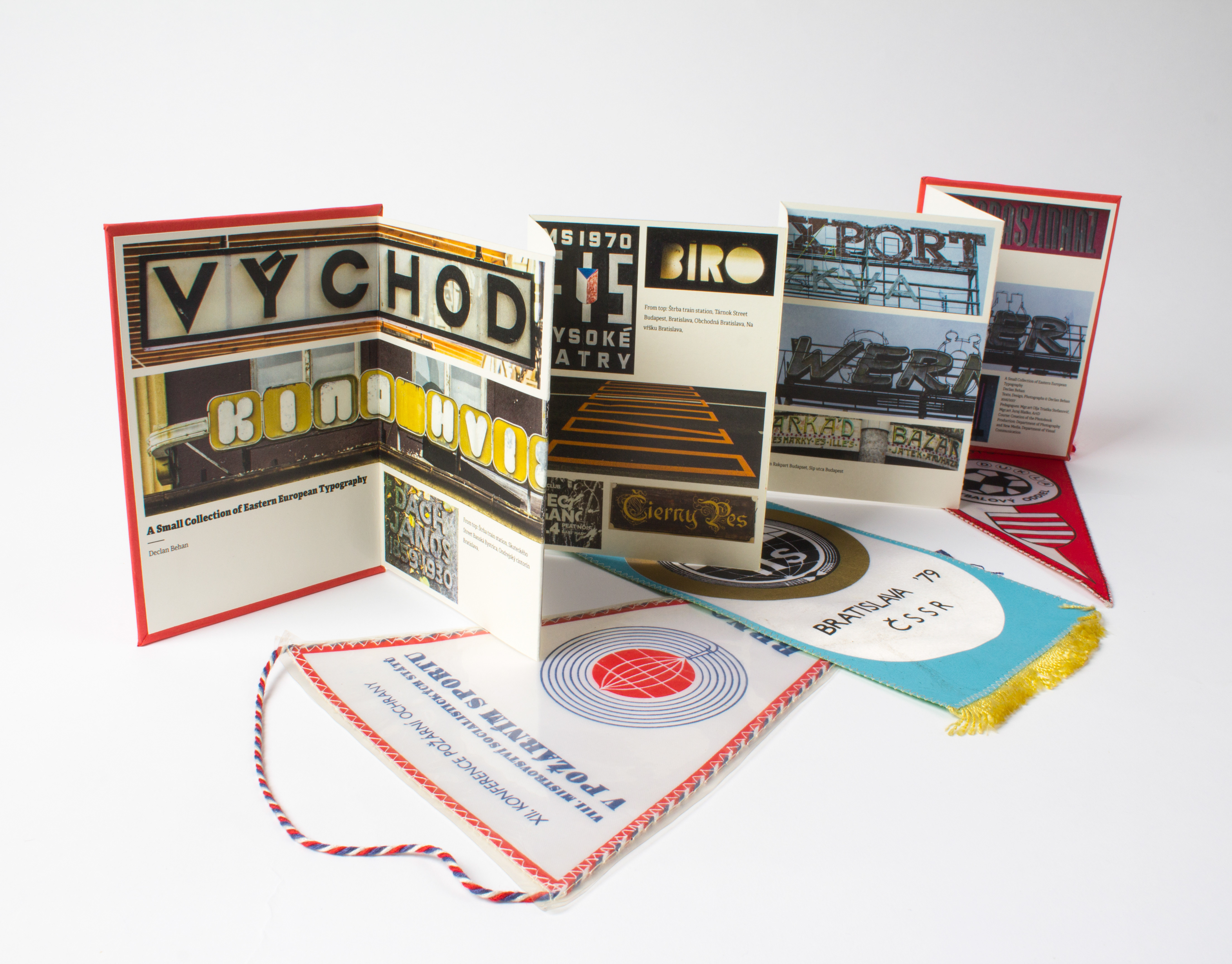
The typeface was created on my Erasmus semester at the Academy of Fine Arts and Design in Bratislava. The initial idea for the typeface came from being exposed to typefaces that I found to be unusual and sometimes bizarre that wouldn’t be very common in Ireland but appeared quite often in Bratislava, particularly in cemeteries and on monuments.
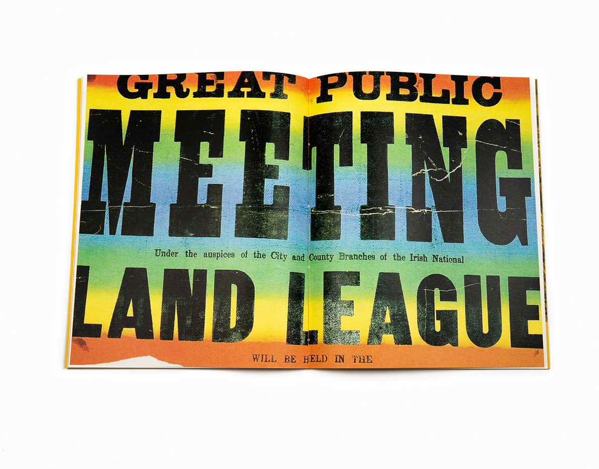
Gaelic type is mostly used for decorative purposes in Ireland nowadays such as on street signs, shop fronts and in cemeteries. However the Irish uncial alphabet originated in medieval manuscripts as an “insular” variant of the Latin alphabet and the first Gaelic typeface was designed in 1571 for a catechism commissioned by Queen Elizabeth to try to convert the Irish Roman Catholic population to Anglicanism. It was used up until the 1960’s when the roman alphabet became the primary alphabet used to print the Irish language.
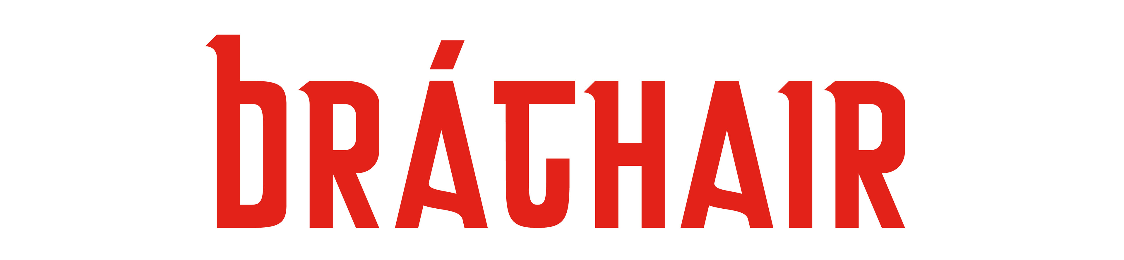
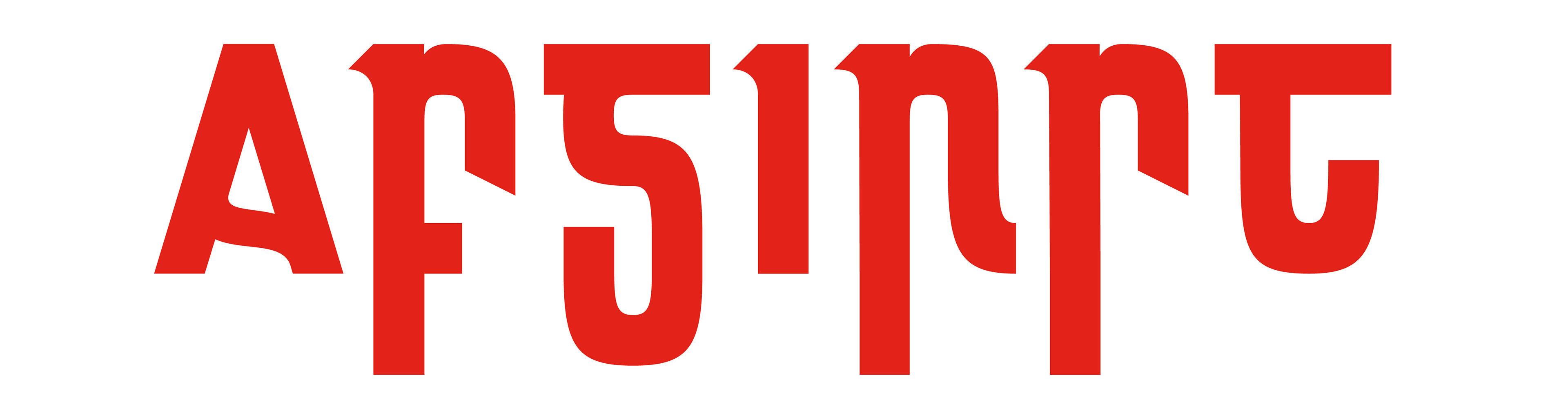
The name for the typeface Bráthair comes from the Irish word for brother as in fellow man. This was also chosen to tie in with the meaning of Bratislava, ‘brother and glory.’

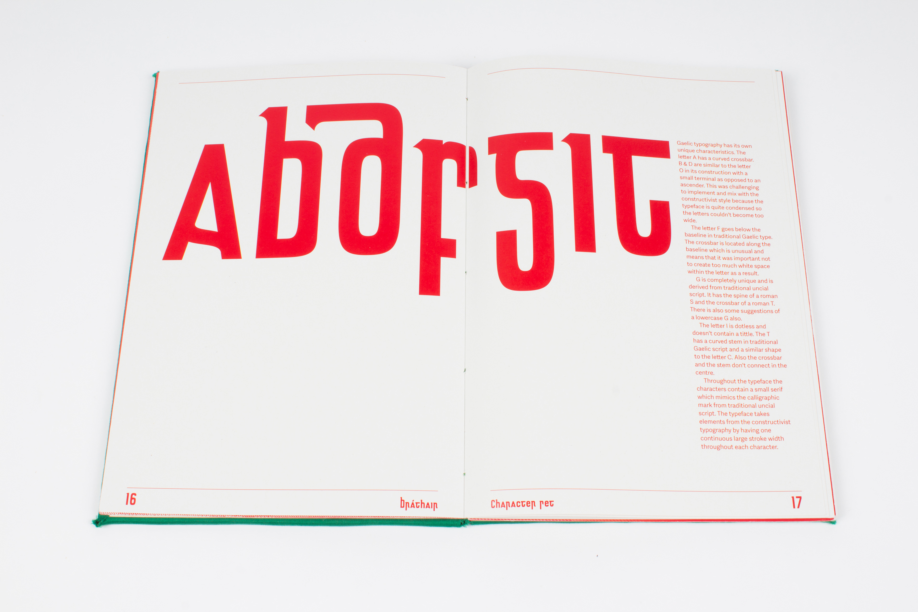
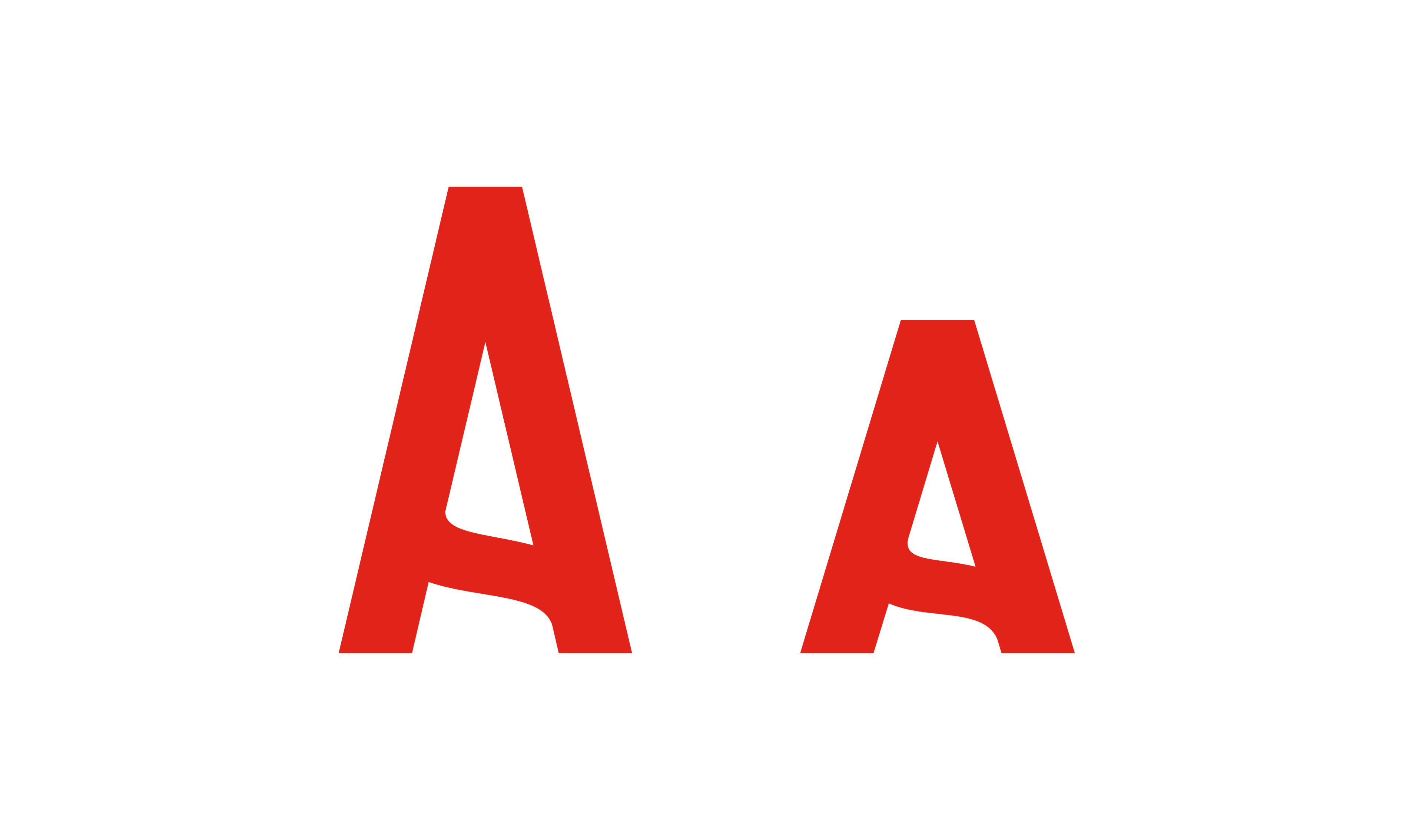
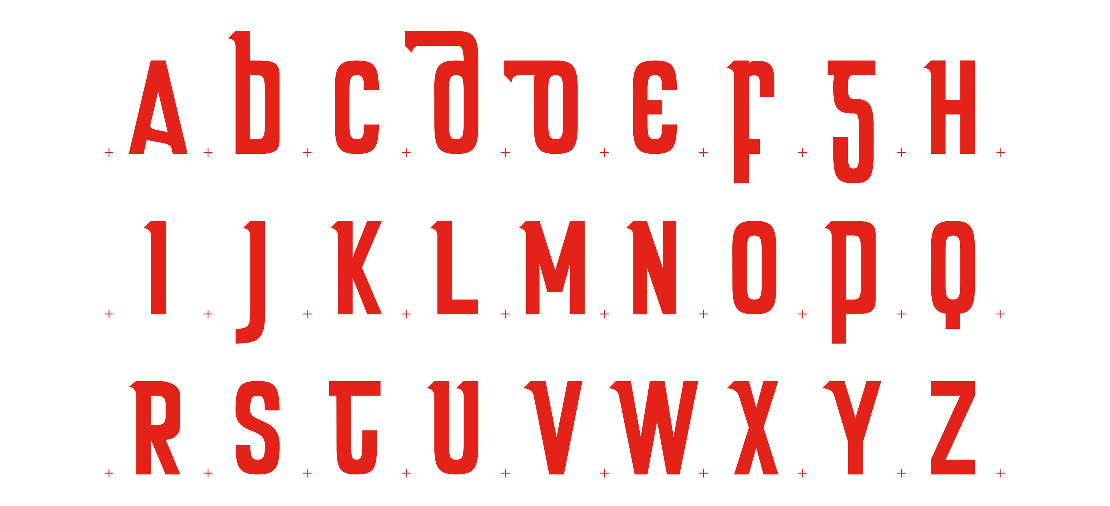
Gaelic typography has its own unique characteristics. The letter A has a curved crossbar. B & D are similar to the letter O in its construction with a small terminal as opposed to an ascender.
The letter F goes below the baseline in traditional Gaelic type. The crossbar is located along the baseline. G is completely unique and is derived from traditional uncial script. It has the spine of a roman S and the crossbar of a roman T. There is also some suggestions of a lowercase G also.
The letter I is dotless and doesn't contain a tittle. The T has a curved stem in traditional Gaelic script and a similar shape to the letter C. Also the crossbar and the stem don't connect in the centre.
Throughout the typeface the characters contain a small serif which mimics the calligraphic mark from traditional uncial script. The typeface takes elements from the constructivist typography by having one continuous large stroke width throughout each character.
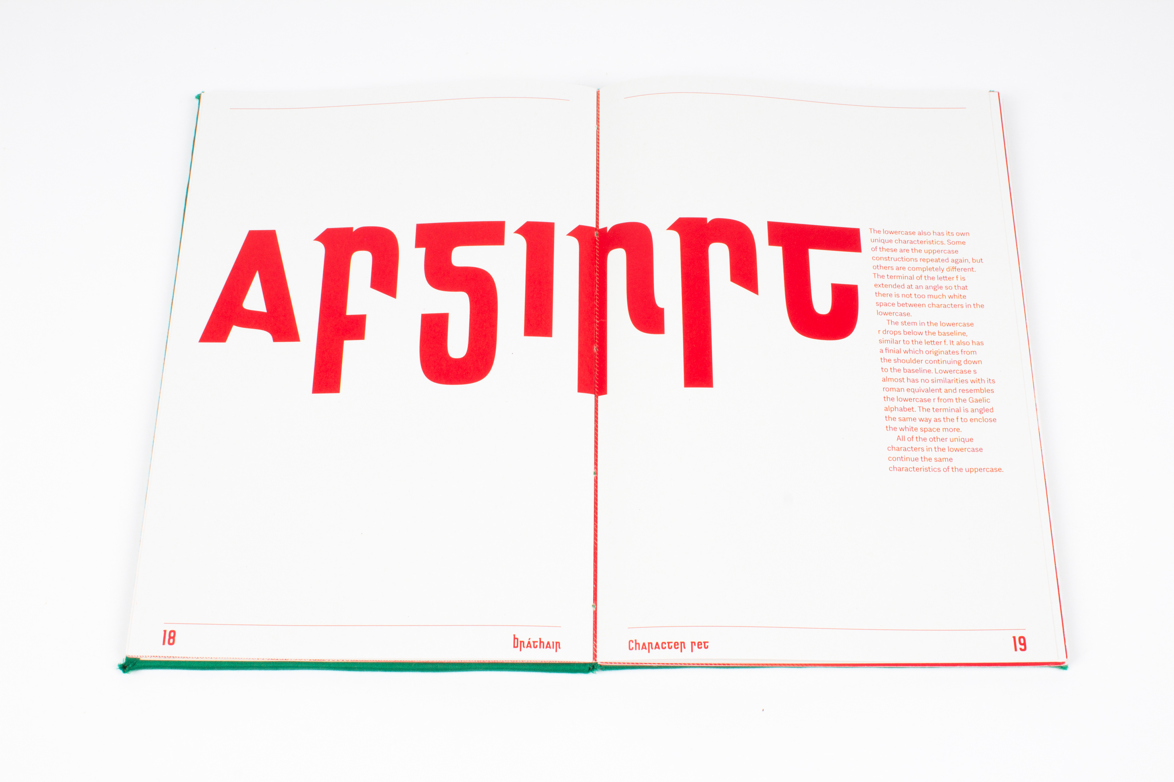
The lowercase also has its own unique characteristics. Some of these are the uppercase constructions repeated again, but others are completely different.
The stem in the lowercase r drops below the baseline, similar to the letter f. It also has a finial which originates from the shoulder continuing down to the baseline. Lowercase s almost has no similarities with its roman equivalent and resembles the lowercase r from the Gaelic alphabet. All of the other unique characters in the lowercase continue the same characteristics of the uppercase.

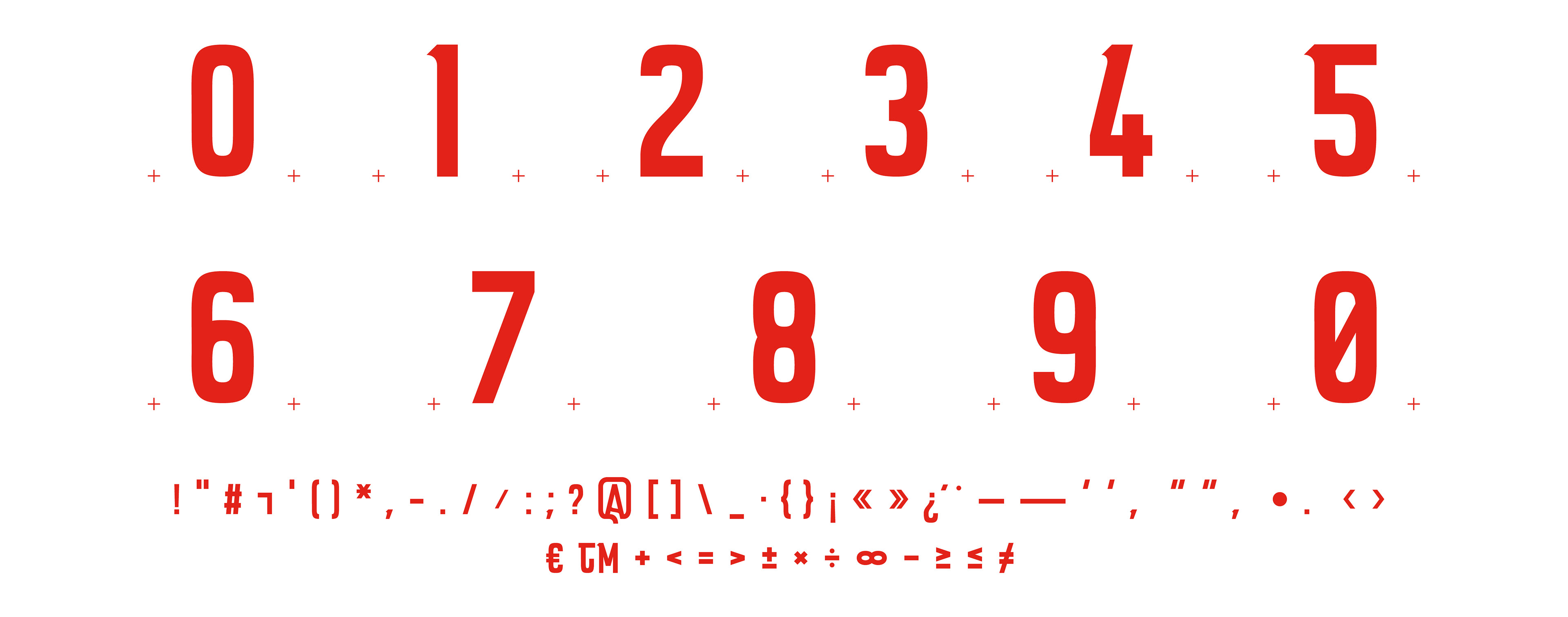

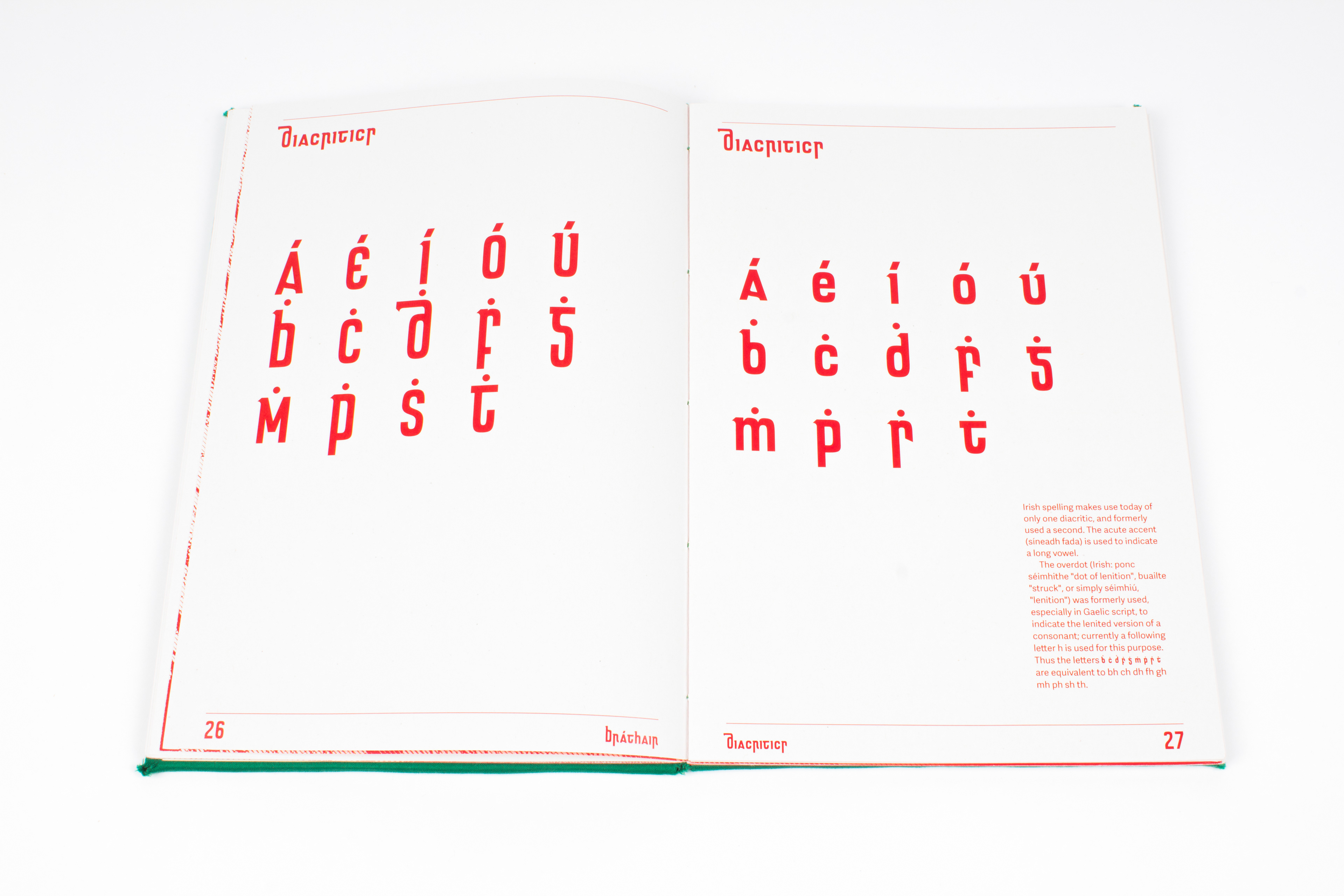
Irish spelling makes use today of only one diacritic, and formerly used a second. The acute accent (síneadh fada) is used to indicate a long vowel.
The overdot (Irish: ponc séimhithe "dot of lenition", buailte "struck", or simply séimhiú, "lenition") was formerly used, especially in Gaelic script, to indicate the lenited version of a consonant; currently a following letter h is used for this purpose. Thus the letters ḃ ċ ḋ ḟ ġ ṁ ṗ ṡ ṫ are equivalent to bh ch dh fh gh mh ph sh th.
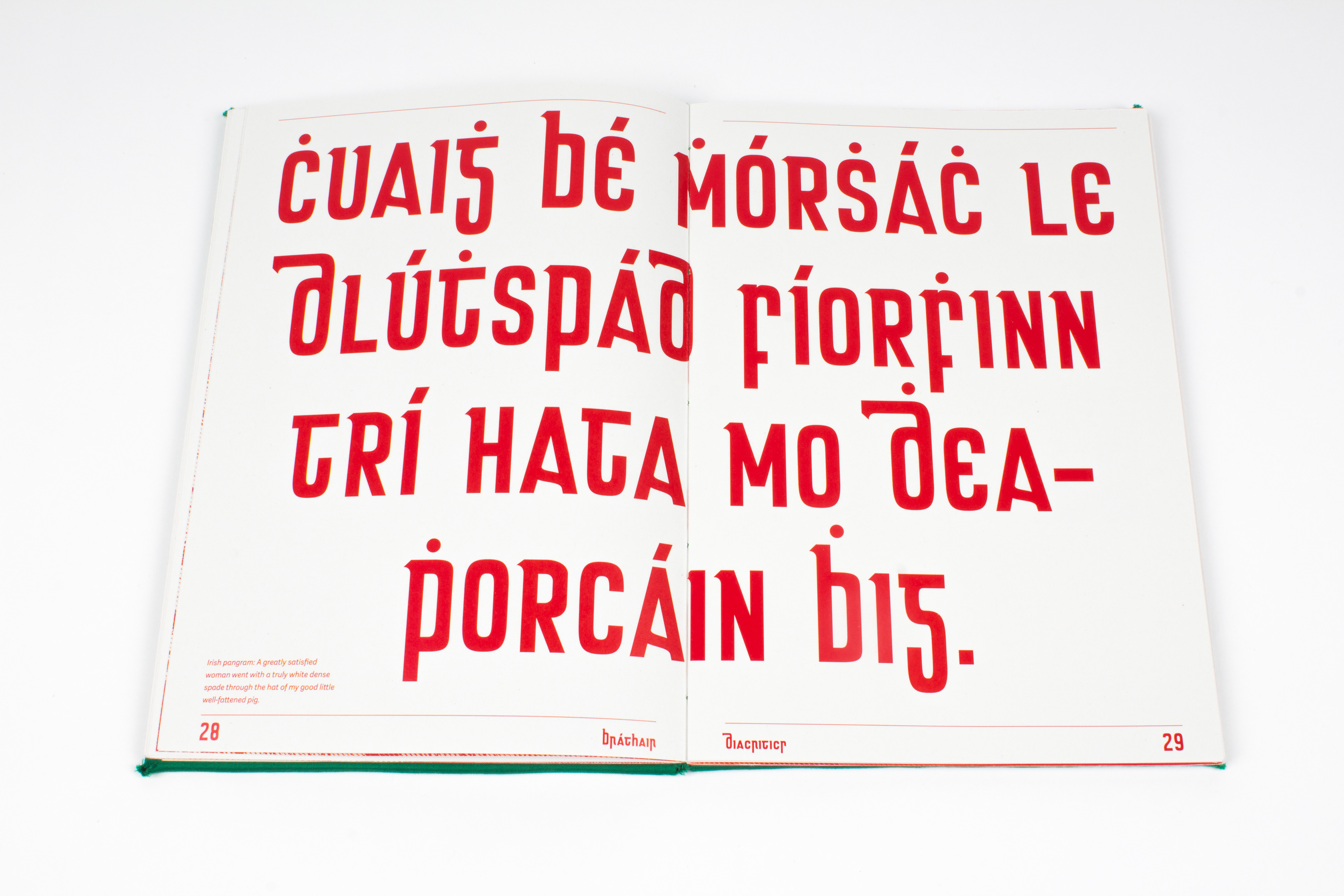
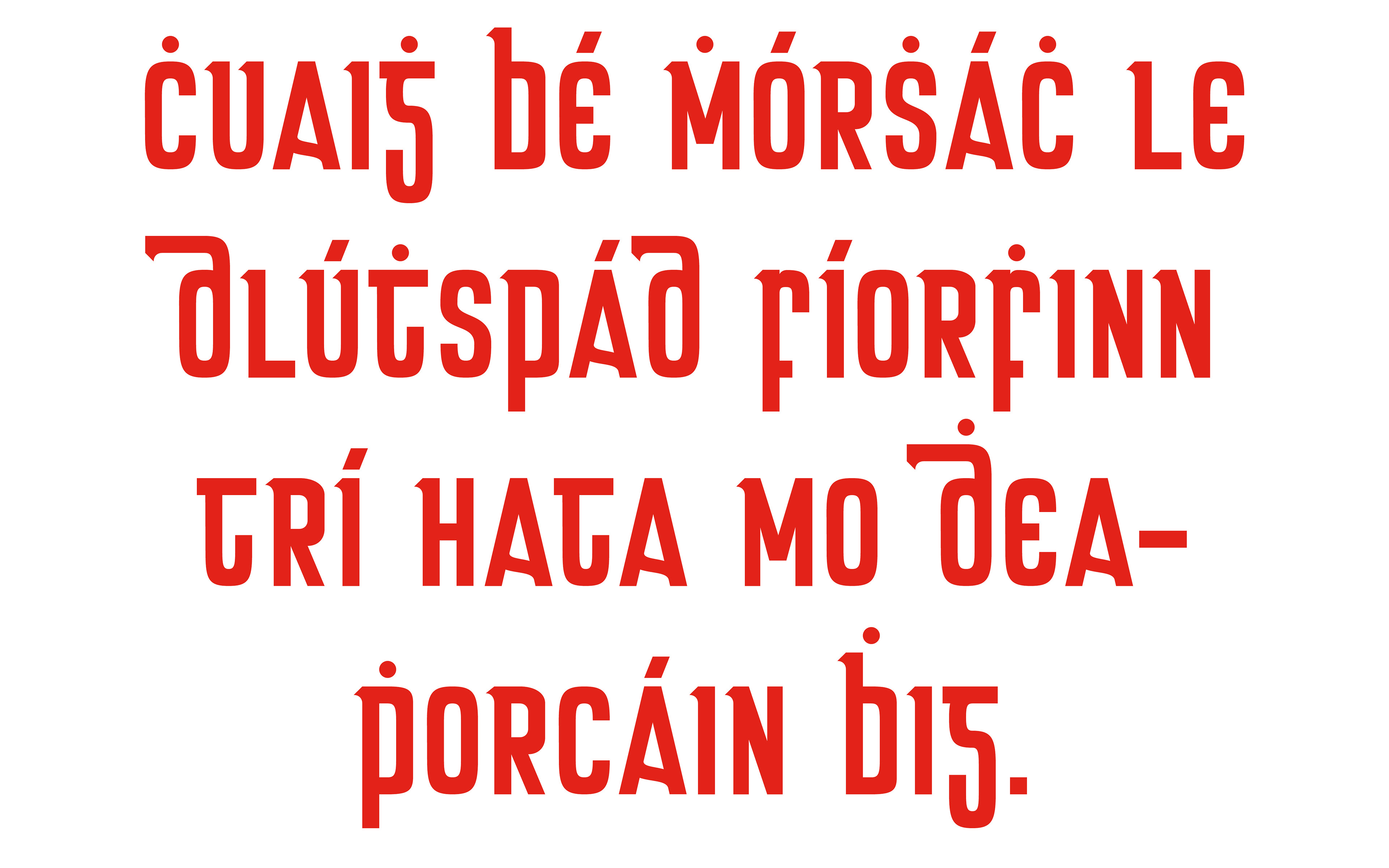
Below is an Irish pangram "A greatly satisfied woman went with a truly white dense spade through the hat of my good little well-fattened pig."
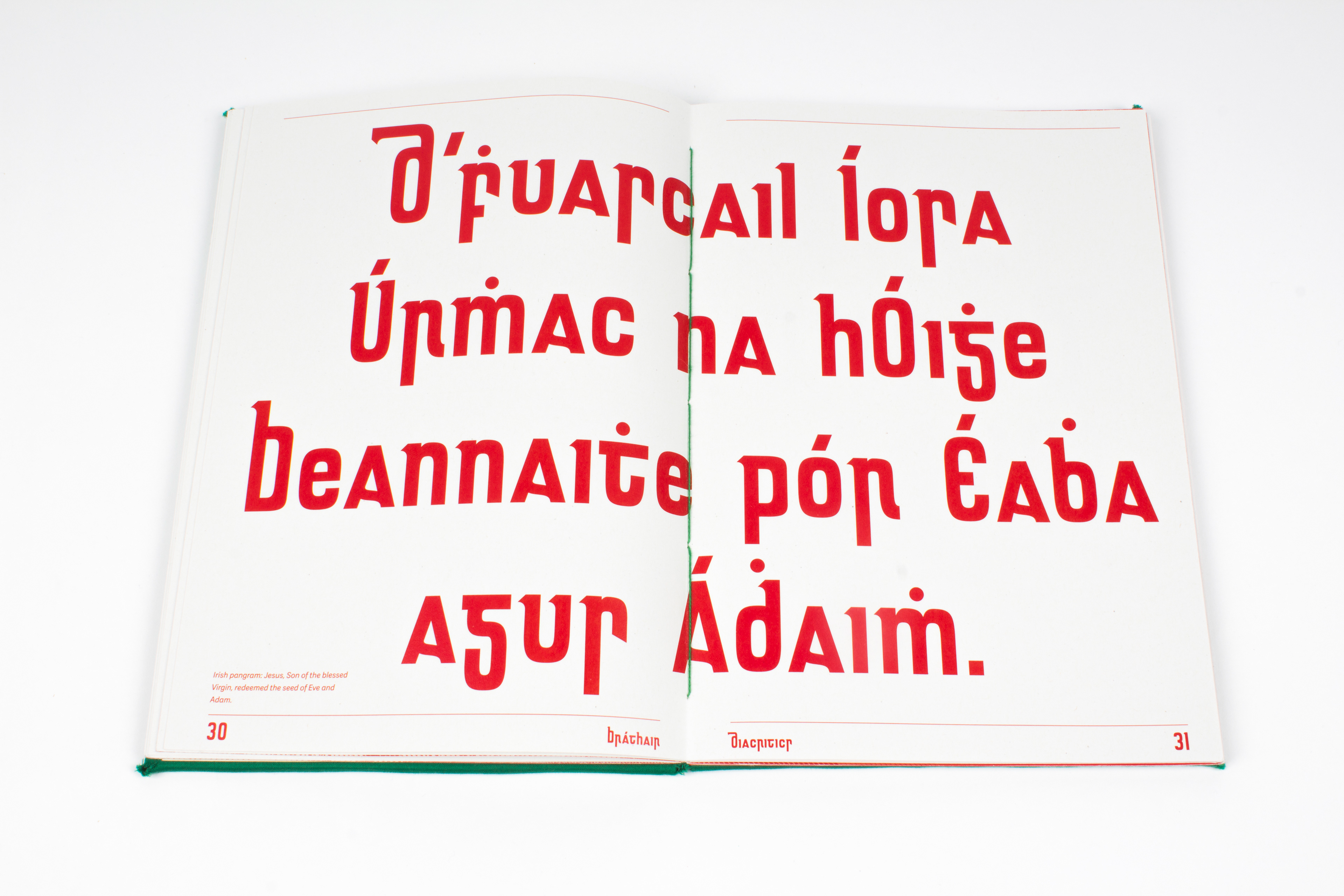
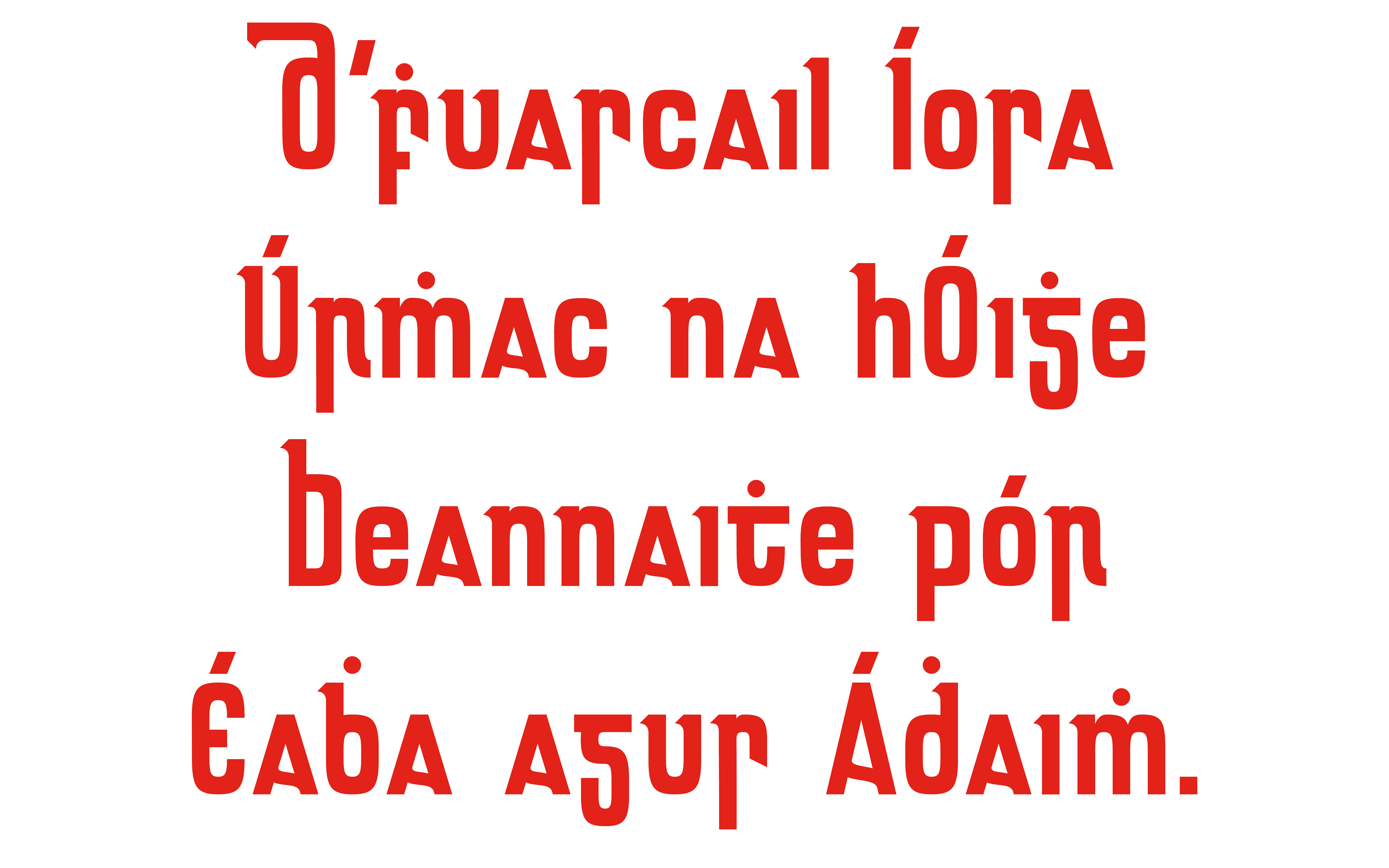
Below is an Irish pangram "Jesus, Son of the blessed Virgin, redeemed the seed of Eve and Adam."
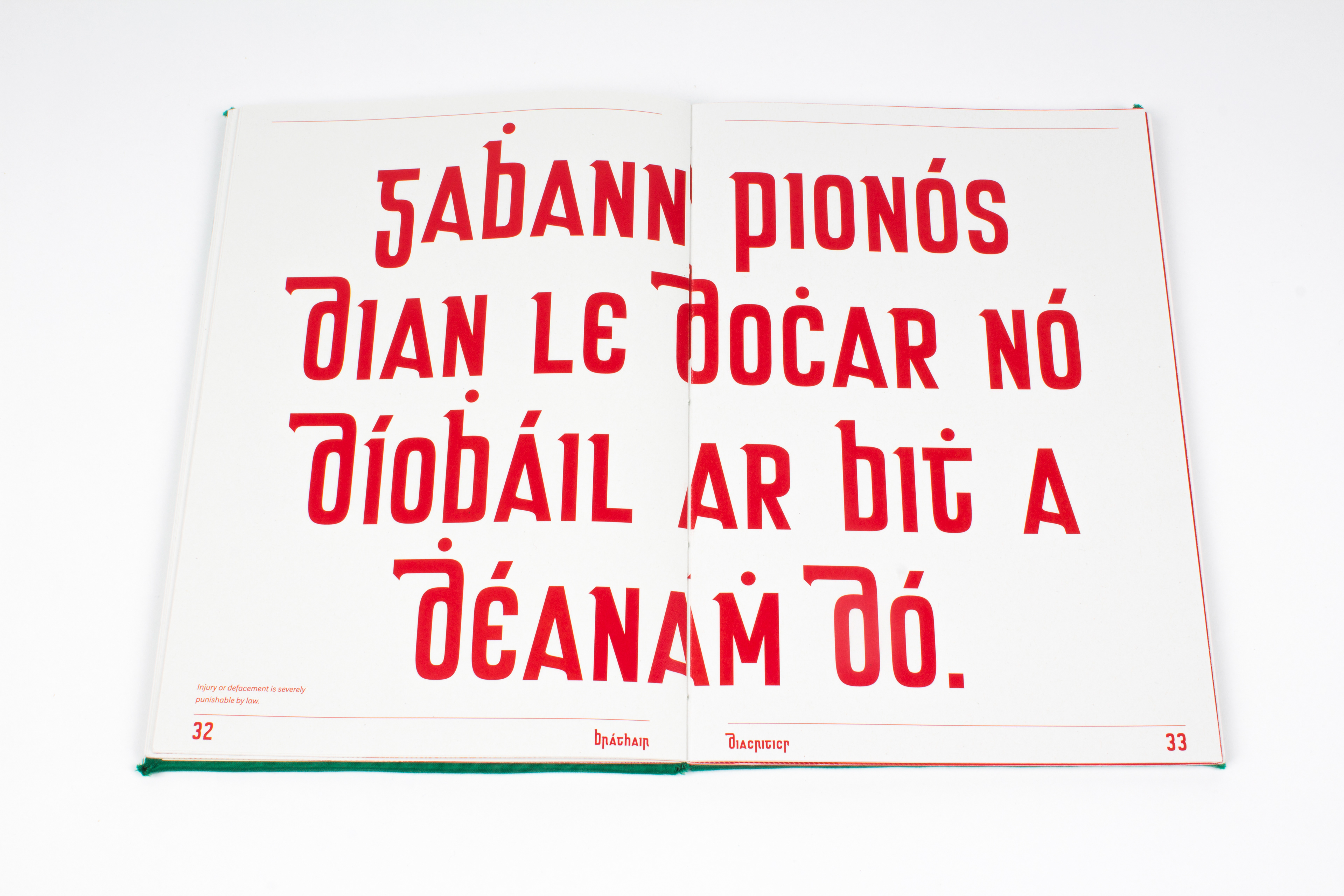
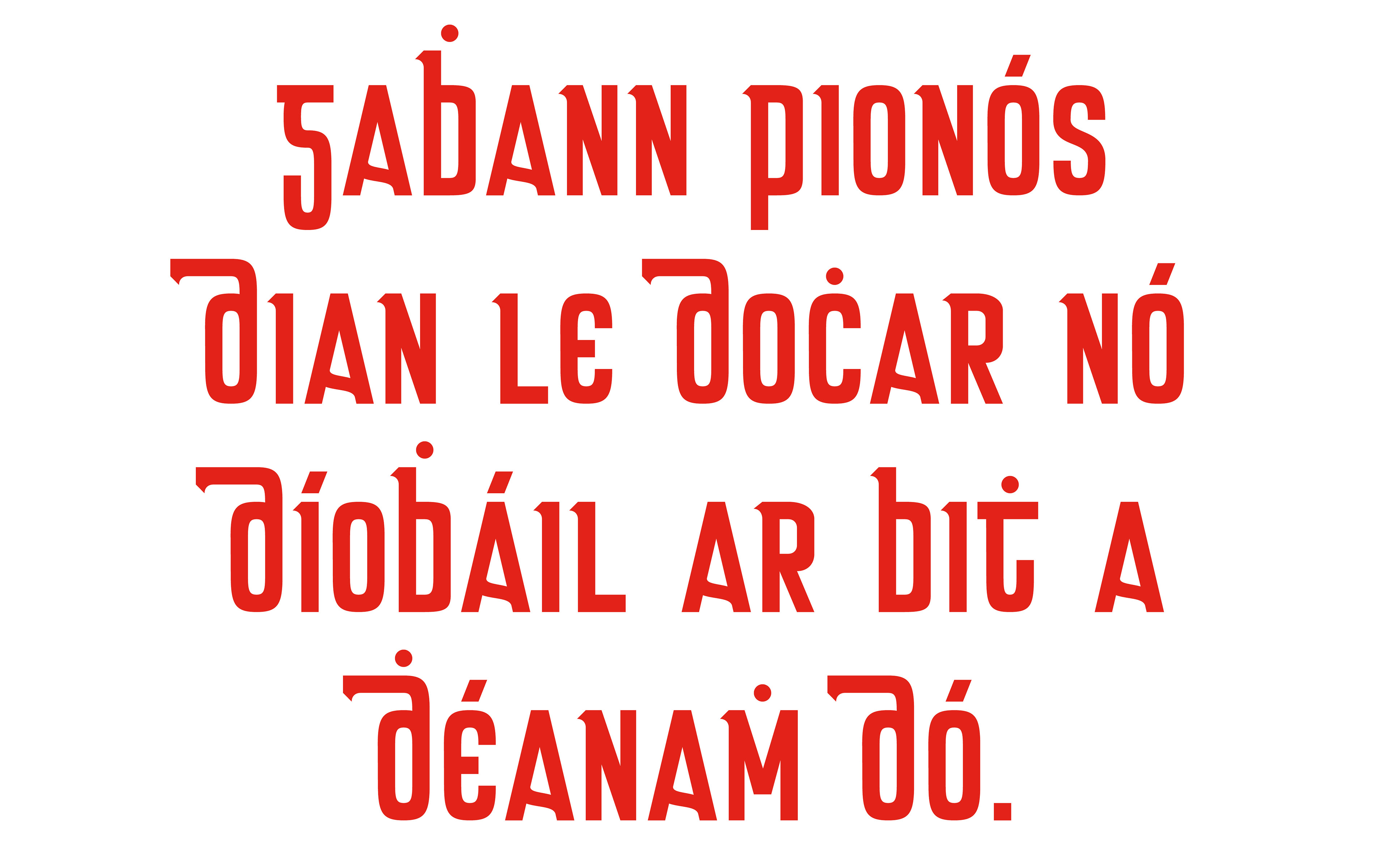
Below: "Injury or defacement is severely punishable by law."
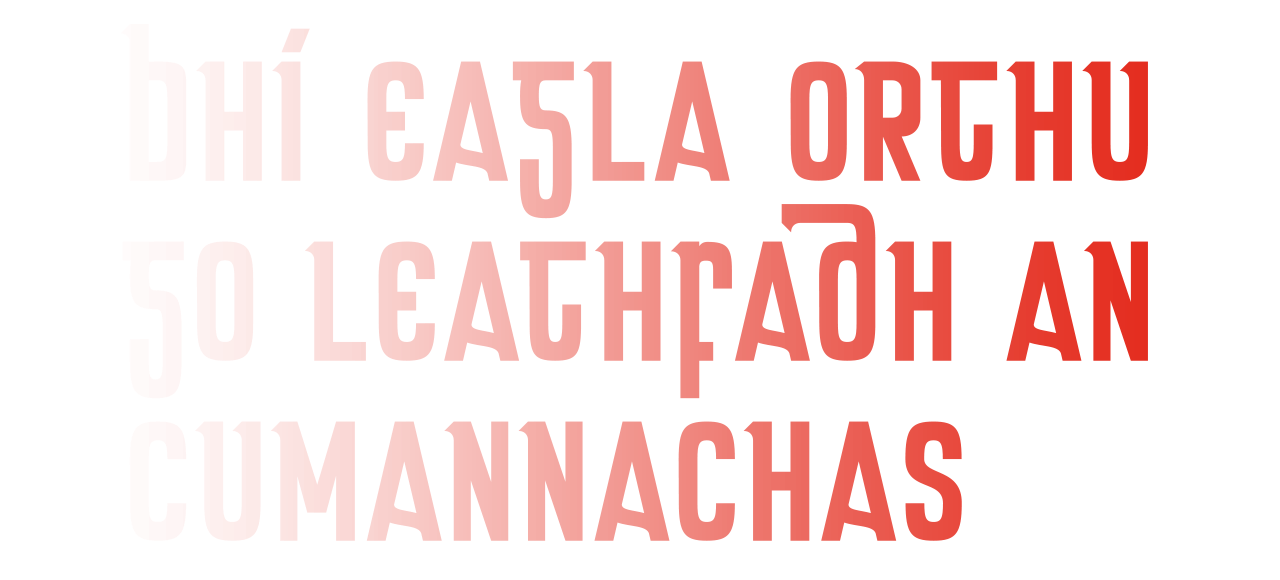
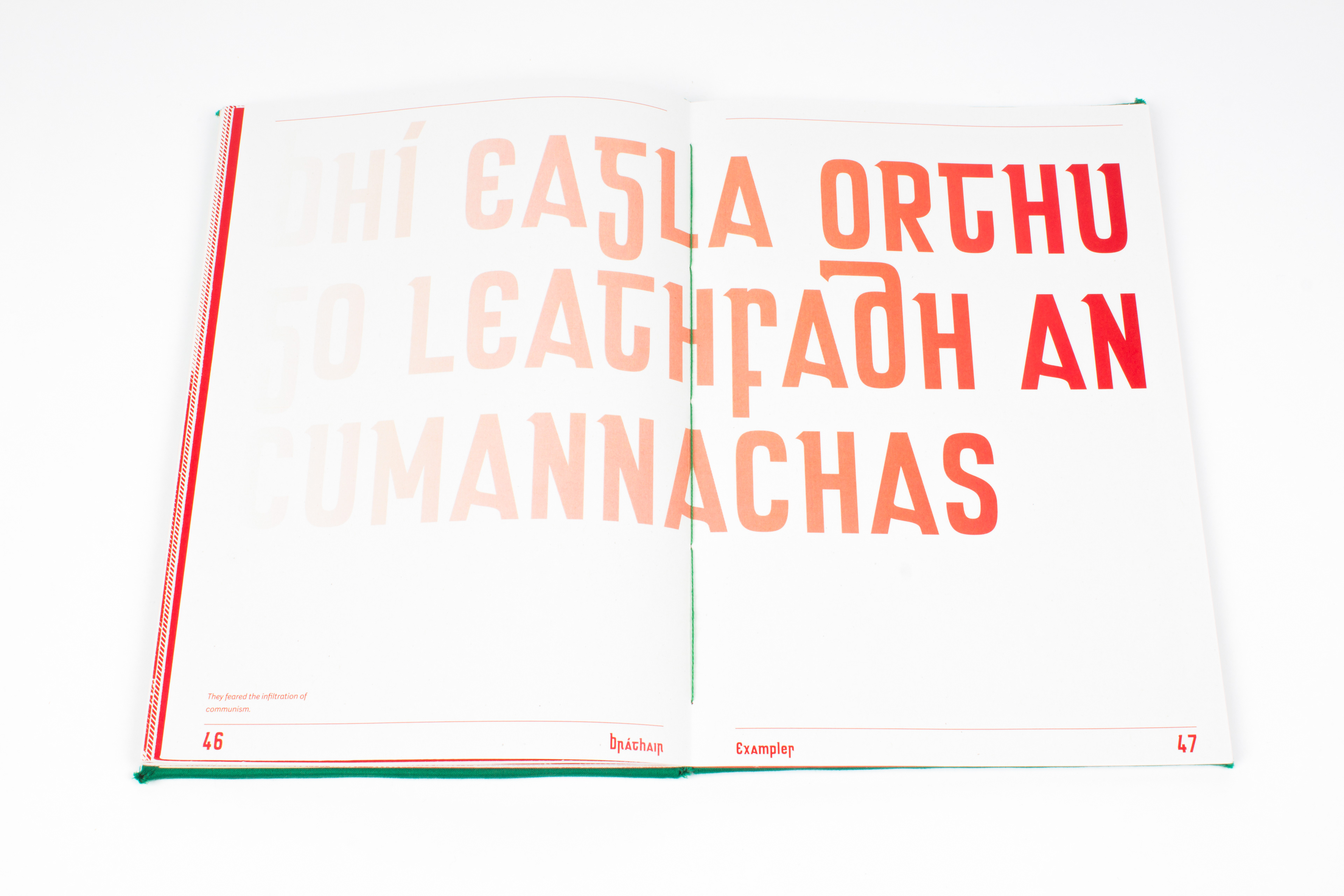
Below: "They feared the infiltration of communism."